Usage metrics overview
AI summary
About AI summaries.
Imply Lumi provides application-level usage metrics to help you understand how your data and queries are performing within Lumi. Use these metrics to derive actionable insights into the health of your Lumi application and proactively address any potential issues.
Metrics in this topic apply to both Lumi Cloud and Lumi Enterprise unless otherwise noted. For infrastructure metrics specific to Lumi Enterprise, see Enterprise usage metrics.
For information about billing, see Billing.
Prerequisites
To view usage data, you need the Admin role. For information on roles and permissions, see Use roles to control access.
Usage overview
Lumi retains usage data for six months.
The Usage page offers a high level overview of system activity along with dashboards to explore individual metrics in more detail. When you click Usage in the navigation menu, the Overview tab opens by default.
The Overview tab is a good starting point to understand your account's overall usage. Other tabs provide dashboards with more detailed views of specific metrics, including metric tiles and graphical and tabular views of your usage data. Click a metric tile to open the corresponding dashboard for a more granular view.
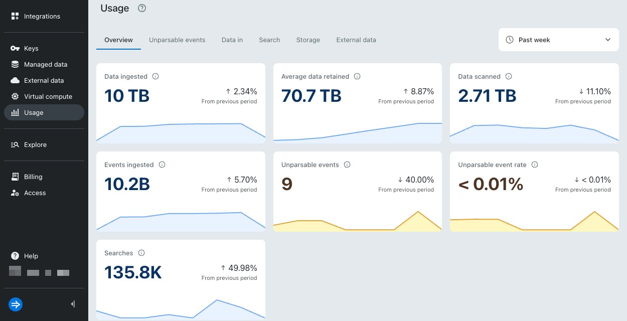
The following table describes the metrics available in the Overview tab:
| Metric | Unit of measure | Description | Applies to |
|---|---|---|---|
| Data ingested | Bytes | Total amount of data ingested. | Lumi Cloud, Lumi Enterprise |
| Average data retained | Bytes | Average amount of data retained for the specified time range. | Lumi Cloud |
| Data scanned | Bytes | Total amount of data scanned for federated searches. | Lumi Cloud, Lumi Enterprise |
| Events ingested | Count | Total number of events ingested successfully. | Lumi Cloud, Lumi Enterprise |
| Unparsable events | Count | Total number of unparsable events. | Lumi Cloud, Lumi Enterprise |
| Unparsable event rate | Percent (%) | Percentage of ingested events that were unparsable. | Lumi Cloud, Lumi Enterprise |
| Searches | Count | Total number of searches executed. | Lumi Cloud, Lumi Enterprise |
Navigate usage dashboards
The usage dashboards show application-level metrics such as unparsable events, ingestion, and search data. In a usage dashboard, you can:
- Use the time range selector to display usage for a specific period.
- Use the search bar to include or exclude events with specific attribute values.
- Use interactive bar charts to show usage data for metered components and display timeline results for specific attributes. Zoom in to see detailed data.
- View usage data in a table grouped by specific attributes.
For a more detailed view, click a row in a table. This opens a side panel that contains information about the selected attribute. Lumi preserves any time filters you apply on the main page and displays the top five values for each attribute. If an attribute has more than five values, a View all button appears. Click View all to see all data for that attribute.
Unparsable events
To view the Unparsable events dashboard, click Usage > Unparsable events.
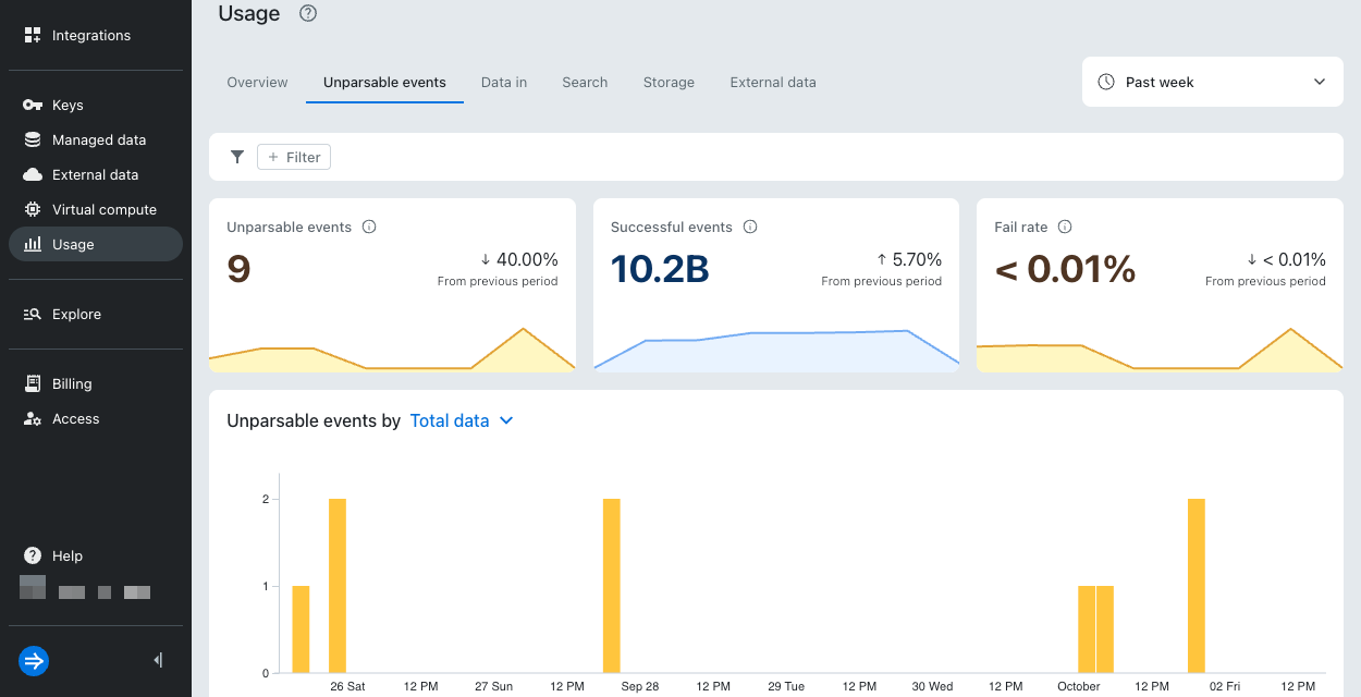
The following table describes the metrics available in the Unparsable events dashboard:
| Metric | Unit of measure | Description |
|---|---|---|
| Unparsable events | Count | Total number of unparsable events. |
| Successful events | Count | Total number of events ingested successfully. |
| Fail rate | Percent (%) | Percentage of ingested events that were unparsable. |
Unparsable events by
The Unparsable events by bar chart shows unparsable events recorded over the selected time period. You can filter results by key, error type, or integration.
Data in
To view the Data in dashboard, click Usage > Data in.
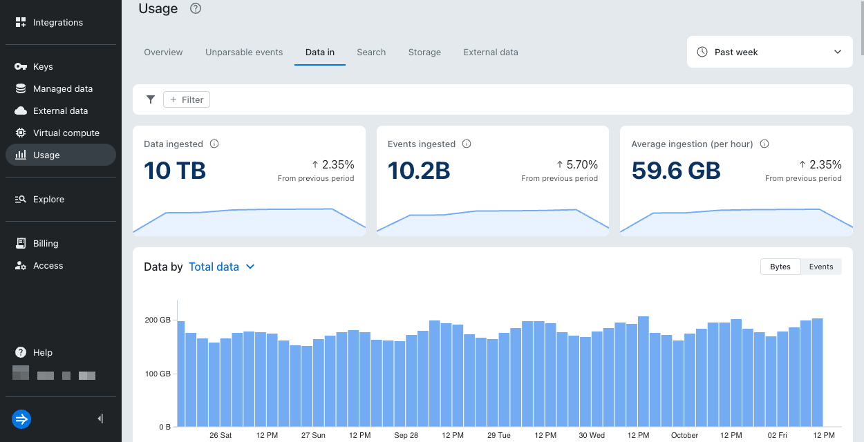
The following table describes the metrics available in the Data in dashboard:
| Metric | Unit of measure | Description |
|---|---|---|
| Data ingested | Bytes | Total amount of data ingested. |
| Events ingested | Count | Total number of events ingested successfully. |
| Average ingestion (per hour) | Bytes | Average amount of data ingested per hour. |
Data by
The Data by bar chart shows data ingested over the selected time period. You can filter results by key, integration, team, or environment.
Search
To view the Search dashboard, click Usage > Search.
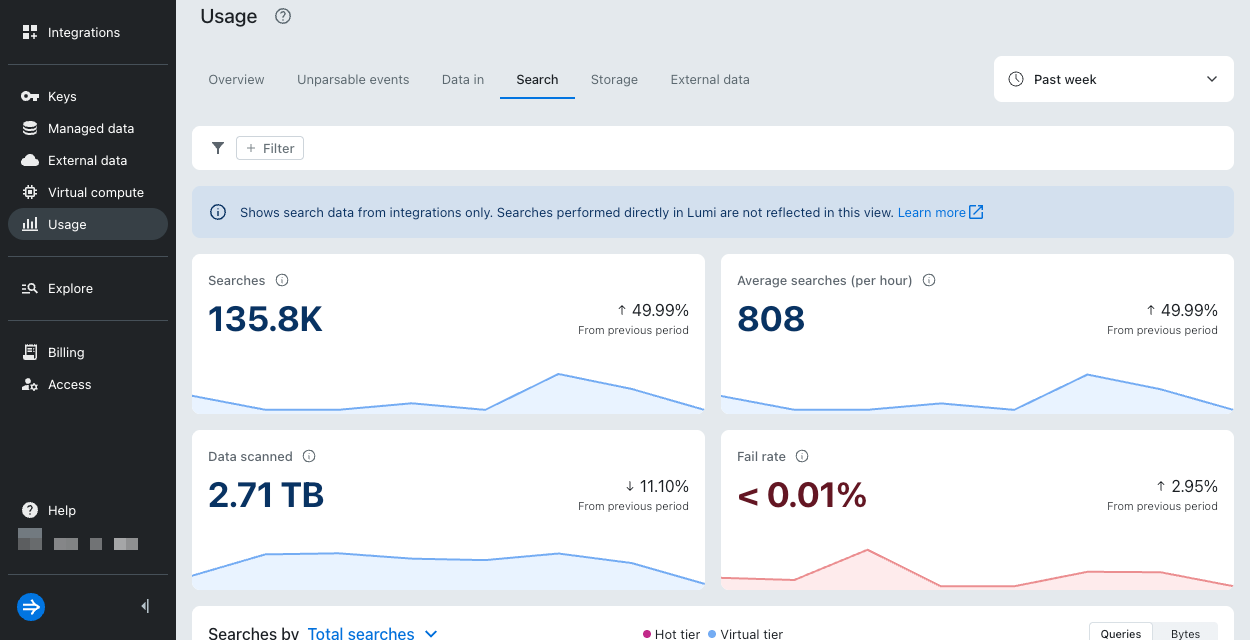
The following table describes the metrics available in the Search dashboard:
| Metric | Unit of measure | Description |
|---|---|---|
| Searches | Count | Total number of federated searches executed. |
| Average searches (per hour) | Count | Average number of federated searches executed per hour. |
| Data scanned | Bytes | Total amount of data scanned for federated searches. |
| Fail rate | Percent (%) | Percentage of federated searches that failed. |
Searches by
The Searches by bar chart shows the total number of queries executed over the selected time period. You can filter results by key, team, or environment.
To view the total amount of data scanned to execute queries, select Total searches from the drop-down and click Bytes.
To filter by or exclude search results for a specific virtual compute pool:
- Click +Filter > Virtual compute pool in the search bar.
- Select a pool from the list of available pools.
- Select = (filter) or ≠ (exclude).
- Click OK.
Storage
Virtual tier is an early access feature. Recommendations in this section are subject to change.
Storage metrics help you understand how your data is distributed across tiers and whether your current tier capacity is appropriate for your workload. Monitoring storage metrics is especially useful for managing costs, planning capacity, and verifying that your tiering rules work as expected.
To view the Storage dashboard, click Usage > Storage.
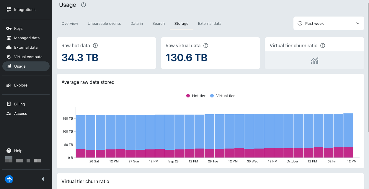
The following table describes the metrics available in the Storage dashboard:
| Metric | Unit of measure | Description | Applies to |
|---|---|---|---|
| Compressed hot data | Bytes | Average size of compressed data distributed across the hot tier over the selected time period. | Lumi Enterprise |
| Compressed virtual data | Bytes | Average size of compressed data distributed across the virtual tier over the selected time period. | Lumi Enterprise |
| Raw hot data | Bytes | Average size of raw data stored in the hot tier over the selected time period. | Lumi Cloud |
| Raw virtual data | Bytes | Average size of raw data stored in the virtual tier over the selected time period. | Lumi Cloud |
| Virtual tier churn ratio | Percent (%) | Percentage of data evicted from virtual storage relative to the data scanned by queries. | Lumi Cloud, Lumi Enterprise |
Storage utilization by tier
This metric is only available in Lumi Enterprise.
The Storage utilization by tier area chart shows the percentage of allocated storage currently in use by each tier. Use this metric to monitor how effectively each tier is utilizing its allocated storage resources:
- Below 50%: Your tier may be underutilized.
- Above 80%: Your tier is near capacity. Consider adjusting the data retention period or increasing the size of your virtual compute pool.
If the hot tier reaches capacity, it can't accept any new data. The impact depends on whether you have a virtual tier configured:
- Without a virtual tier: Data outside the hot tier becomes unavailable for query. Lumi continues to ingest new data, but you can't query that data until you increase your hot tier capacity or configure the virtual tier.
- With a virtual tier: You can still query excess data through the virtual tier.
If your virtual tier reaches capacity, Lumi evicts less recently accessed data from the caching layer to make room for newly requested data. The evicted data gets reloaded into virtual storage as needed.
Average data stored
This metric is only available in Lumi Enterprise.
The Average data stored bar chart shows the average amount of compressed data stored per tier over the selected time period. Use this metric to track your typical storage footprint and compare how much data is stored in each tier over time.
Average raw data stored
This metric is only available in Lumi Cloud.
The Average raw data stored bar chart displays the average amount of raw data stored per tier over the selected time period. Use this metric to track your typical storage footprint and compare how much data is stored in each tier over time.
Virtual tier churn ratio
The Virtual tier churn ratio line chart shows the percentage of data evicted from virtual storage relative to the data scanned by queries. The evicted data gets reloaded into virtual storage as needed. Use this metric to determine whether your virtual tier is properly sized.
The following is general guidance for interpreting your virtual tier churn ratio:
- Below 50%: Your virtual tier is properly sized. Consider gradually reducing your virtual tier infrastructure to find the right balance between cost and performance. Note that 0% churn doesn't signify that there is an issue. It could mean that virtual storage already contains the data that satisfies the queries.
- Above 50%: Your virtual tier may be undersized. Consider increasing virtual tier infrastructure or expanding the hot data retention period.
Learn more
See the following topics for more information:
- Send events to Lumi for details on sending events to Lumi.
- Federated search reference for searching Lumi events from Splunk® using SPL.
- Manage virtual compute pools for details on how to create and manage virtual compute pools.
- Manage tiering rules to create and manage tiering rules.
- Manage deletion rules to set up automatic data deletion.