Visualizations reference
Imply Polaris provides a wide array of expressive visualizations to enable fast, interactive exploration of your data. Visualizations are not static charts. You can interact directly with them by clicking on various graphical elements to select data segments for drill-down and deeper analysis.
When you change the shown dimensions, Polaris chooses the best visualization for the selected dimensions automatically.
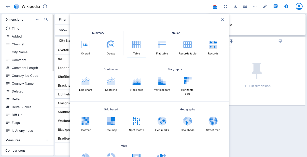
To select an alternative visualization, click the current visualization type on the right side of the screen to display the visualization selector. The following example shows Table as the current visualization:
The following sections describe the available visualizations.
Explore visualizations
Explore visualizations are highly configurable and use an Imply variety of SQL for efficient querying of your data. The explore visualizations are:
- Overall (beta)
- Bar chart (beta)
- Flat table
- Gauge
- Multi-axis line chart (beta)
- Records table (explore) (beta)
- Time series
Where two similar visualization are available, for example multi-axis line chart (explore type) and line chart, we recommend using the explore type if it suits your requirements.
Overall (explore)
The default visualization is the overall visualization. It presents a numeric summary of selected measures with your specified filter criteria. If you don't have the beta visualization enabled, see the Overall visualization.
To enable this beta feature, contact Polaris support. Once enabled, the new overall visualization replaces the standard overall visualization.
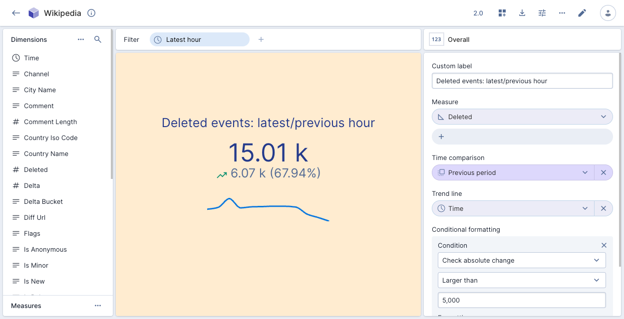
You can use the properties panel to add measures, define a time comparison, add a trend line, and configure conditional formatting.
Conditional formatting
If you create an overall visualization with a single measure, you can apply conditional formatting to color the visualization to indicate data severity—green for okay, amber for warning, red for critical.
To add conditional formatting, click the paintbrush icon in the visualization pane on the right, and then click Add condition. Select the condition to apply to the data and the corresponding formatting. You can create multiple conditions.
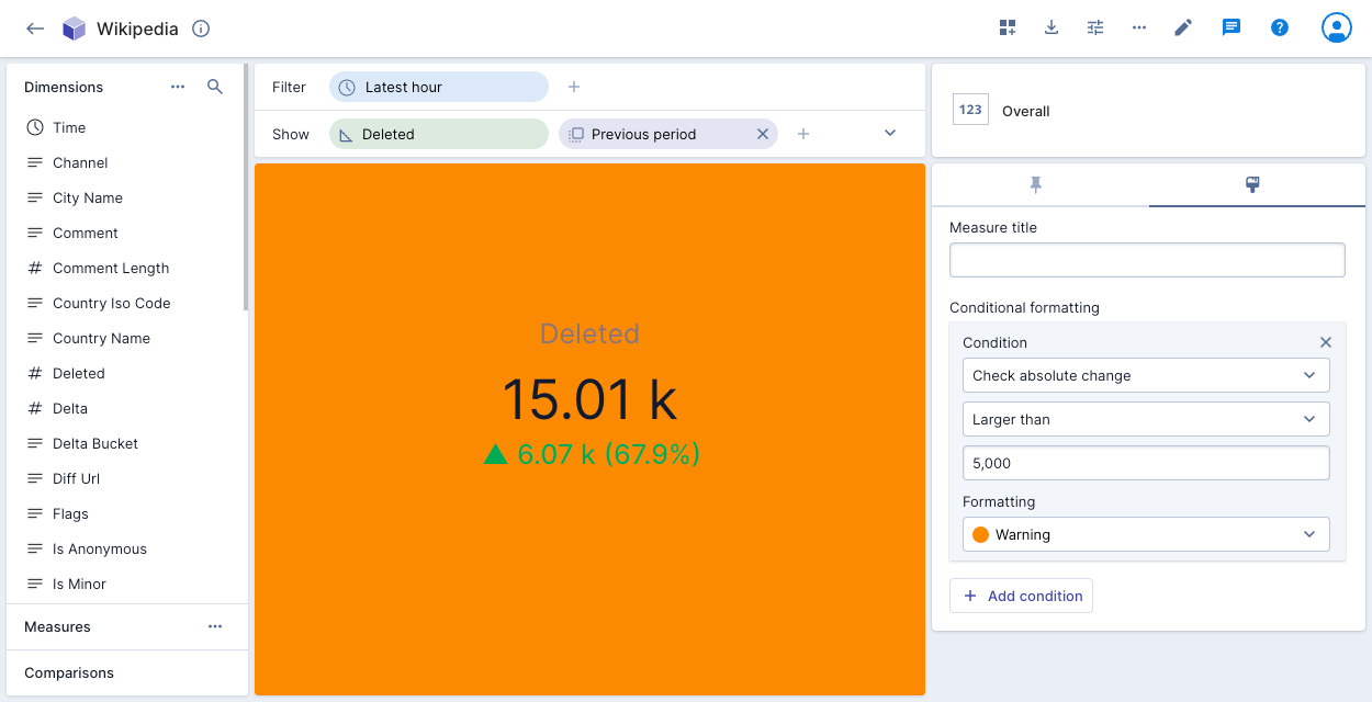
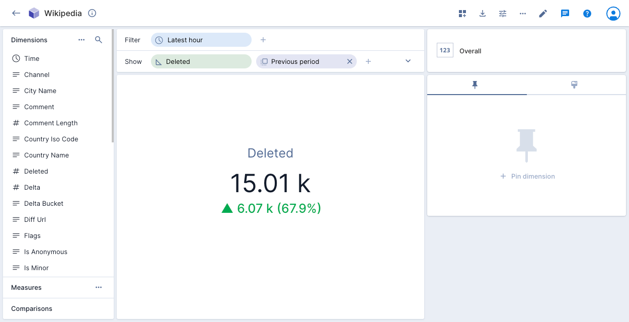
You can also create a condition based on a comparison. In the following example, the amber color of the visualization indicates that the absolute change in number of deleted events for the previous hour was more than 5,000:
If you add an overall visualization tile with conditional formatting to a dashboard page, the colored icon next to the page name indicates the severity of the data on the page. See Create a dashboard page for more information.
The following example shows the number of events deleted in the latest hour compared to the previous period, with conditional formatting:
Band chart
The band chart visualization allows you to display a primary metric as a line within upper and lower bound measures. You can use it to identify when values fall outside expected ranges or to show the relationship between a central measure and its constraints.
To enable this feature, contact Polaris support.
Set the following Fields in the visualization:
- Time column: Time column and bucketing.
- Time comparison: Time comparison period for the measures.
- Measures: Select up to 10 measures to appear on the chart.
- Upper bound: Select a measure for the upper bound.
- Lower bound: Select a measure for the lower bound.
You can also set the following options in the Customizations tab:
- Chart title: Set a title for the band chart.
- Color: Set the line color for each measure.
- Interpolate: Select how to fill empty values.
- Axis alignment: Position the y-axis on the left or right side.
- Points: Show or hide data points.
- Line style: Display a smooth, line, or step chart.
- X axis: Add an axis title and select a label orientation.
- Y axis: Label each line, set the precision, select a label orientation, set a maximum axis value, set a scale interval between tick marks, set a scale type, and select a format. Polaris inherits the format from the measure by default.
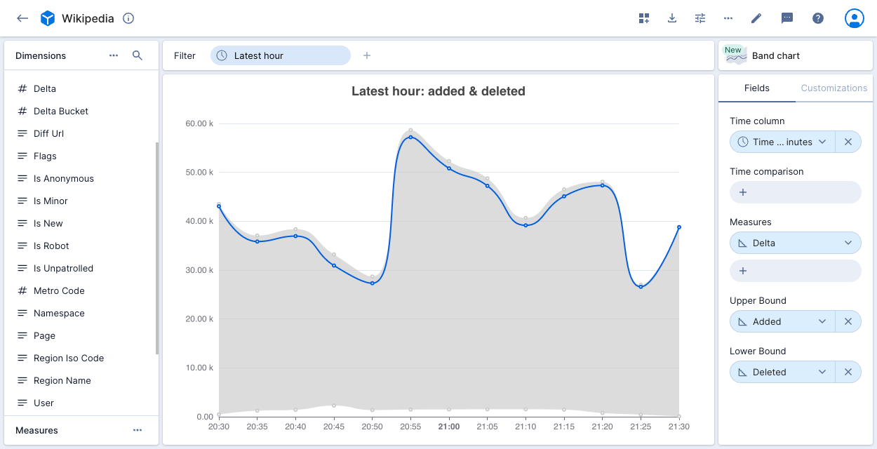
The following example shows Wikipedia editing activity. It visualizes the net change in content (Delta) as a blue line within a band bounded by bytes Added (upper line) and Deleted (lower line).
The band width indicates total editing intensity and the position of the line shows whether edits are adding or removing content. When the line is near the top, more content is being added than deleted.
Bar chart
The bar chart displays dimensional data as vertical bars.
To enable this beta feature, contact Polaris support. Once enabled, you can continue to access the original vertical bars chart.
Set the following Fields in the visualization:
- X-axis: Set a column to display on the x-axis. You can limit the number of values to display and sort by measure or dimension.
- Values: Select multiple measures to appear as separate bar charts.
- Stack: Break down the data in the bars across an additional dimension. You can limit the number of stack values and sort by measure or dimension.
- Compare: Time comparison period for the values.
You can also set the following options in the Customizations tab:
- Chart title: Set a title for the bar chart.
- Color: Set colors for each bar.
- Group series: If you added a Stack dimension, you can group the series horizontally instead of stacking them vertically.
- Show bar values: Show the value of each bar on the chart.
- Legend position: Set the position of the chart legend.
- X axis: Add an axis title and select a label orientation.
- Y axis: Add an axis title, set the decimal precision, set minimum and maximum axis values, select a format (Polaris inherits the format from the measure by default), and a scale type.
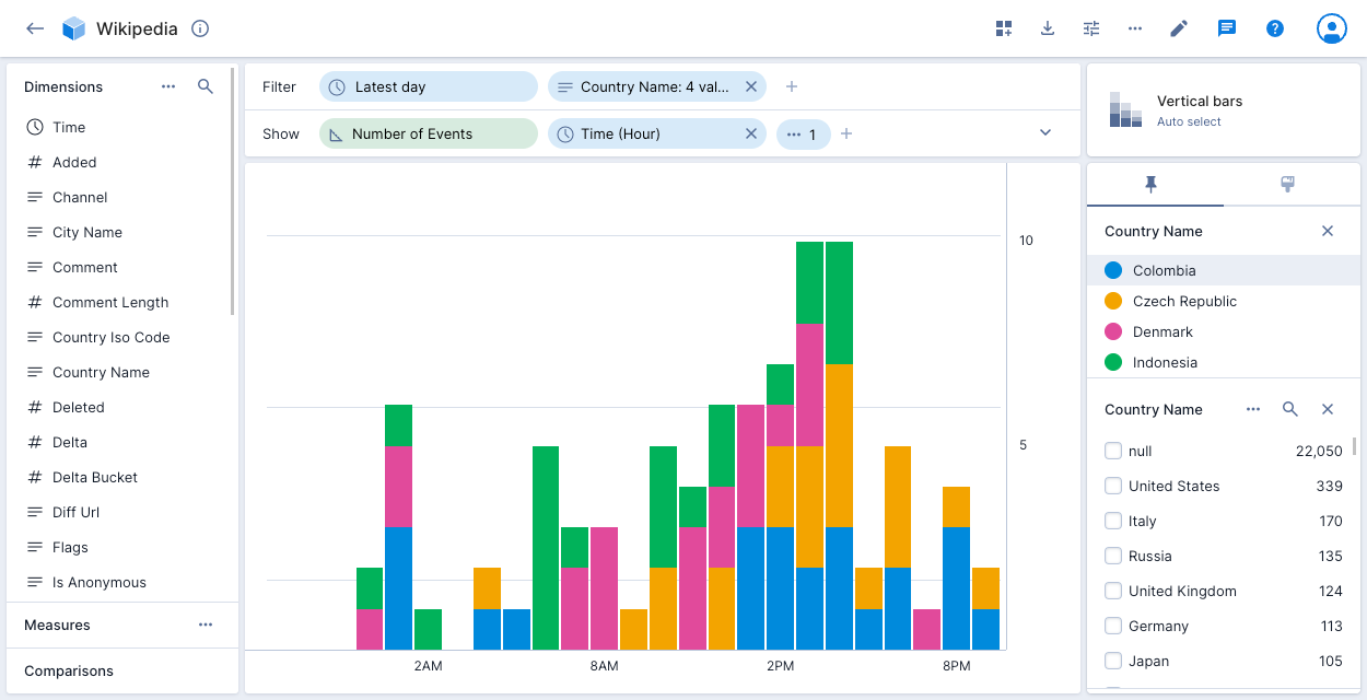
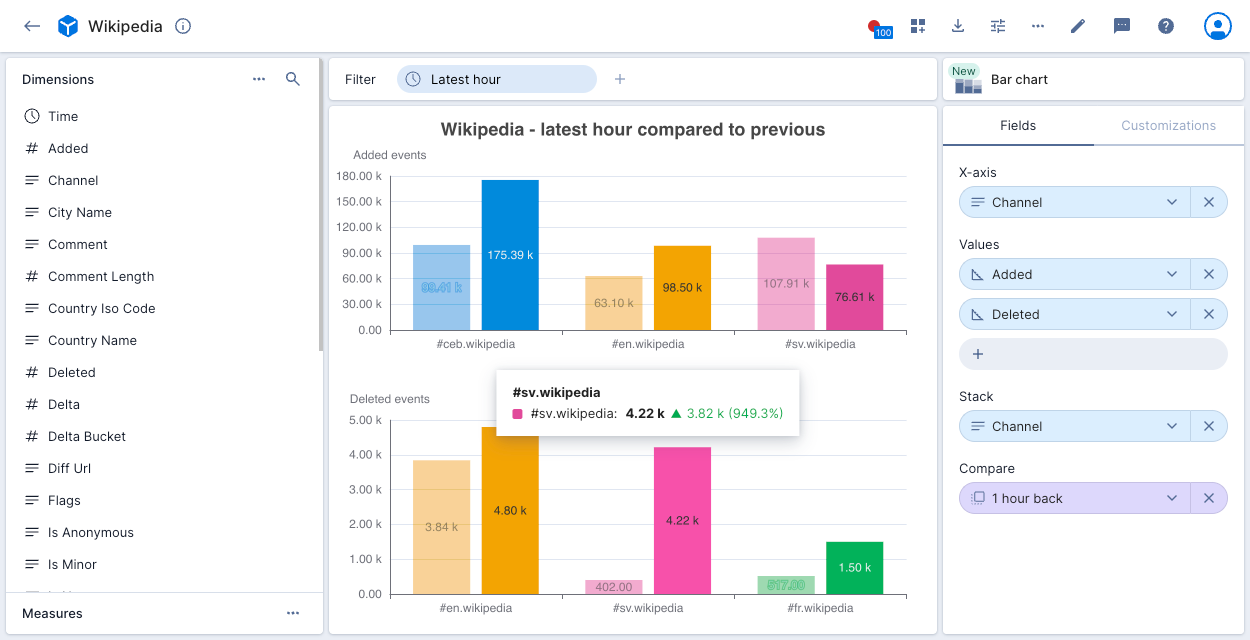
The following example shows three Wikipedia Channel measures with a chart for Added events and a chart for Deleted events. The charts display the number of events for the latest hour compared to the previous hour. Clicking any point on the chart allows you to exclude or filter on the selected data.
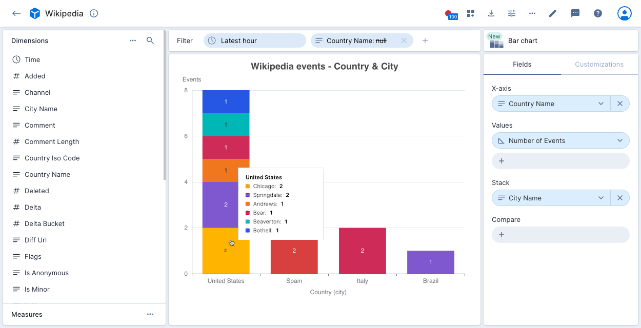
The following example shows Wikipedia events by Country Name, broken down by stack dimension City Name.
Flat table
The flat table visualization is similar to the table visualization, but it displays flattened data instead of nested data.
Set the following properties in the visualization:
- Group data by: One or more columns to group data by, and the sort to apply to each.
- Pin columns: Pins Group data by columns to the left.
- Columns: Additional columns to display. You can select what to display when a column contains multiple values.
- Select a Pivot column and one or more Measures, and the visualization displays a column for each combination.
- Max rows: Limit the number of rows displayed in the visualization.
Flat table visualizations translate to queries with GROUP BY on multiple columns. This causes Druid to ignore ranking approximation settings (approximateTopN) even when Exact results only is disabled for the underlying data cube.
For columns that contain URLs, hold Cmd (or Ctrl) and click the URL to open it in a new tab.
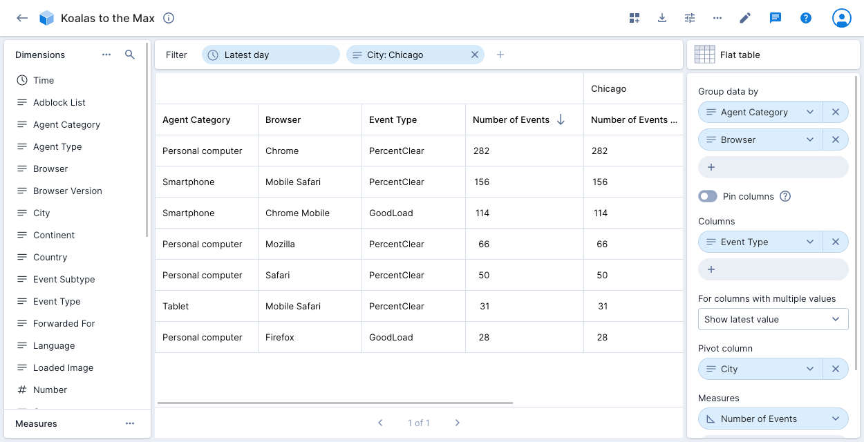
The following example shows the Number of Events for City: Chicago in the Koalas to the Max data cube. The data is grouped by Agent Category and Browser. The table shows the additional column Event Type. If event type contains multiple values, Polaris displays the latest value.
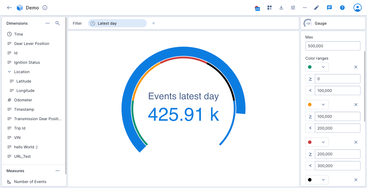
Gauge
The gauge visualization displays a summary of a selected aggregate as a gauge.
The gauge shows a number or percentage proportional to the Min and Max values you set. You can color specified ranges, set a custom label, and show a legend.
The following example shows the number of events for the latest day in the Demo data cube, proportional to the maximum 500,000. The legend shows four colored numeric ranges.
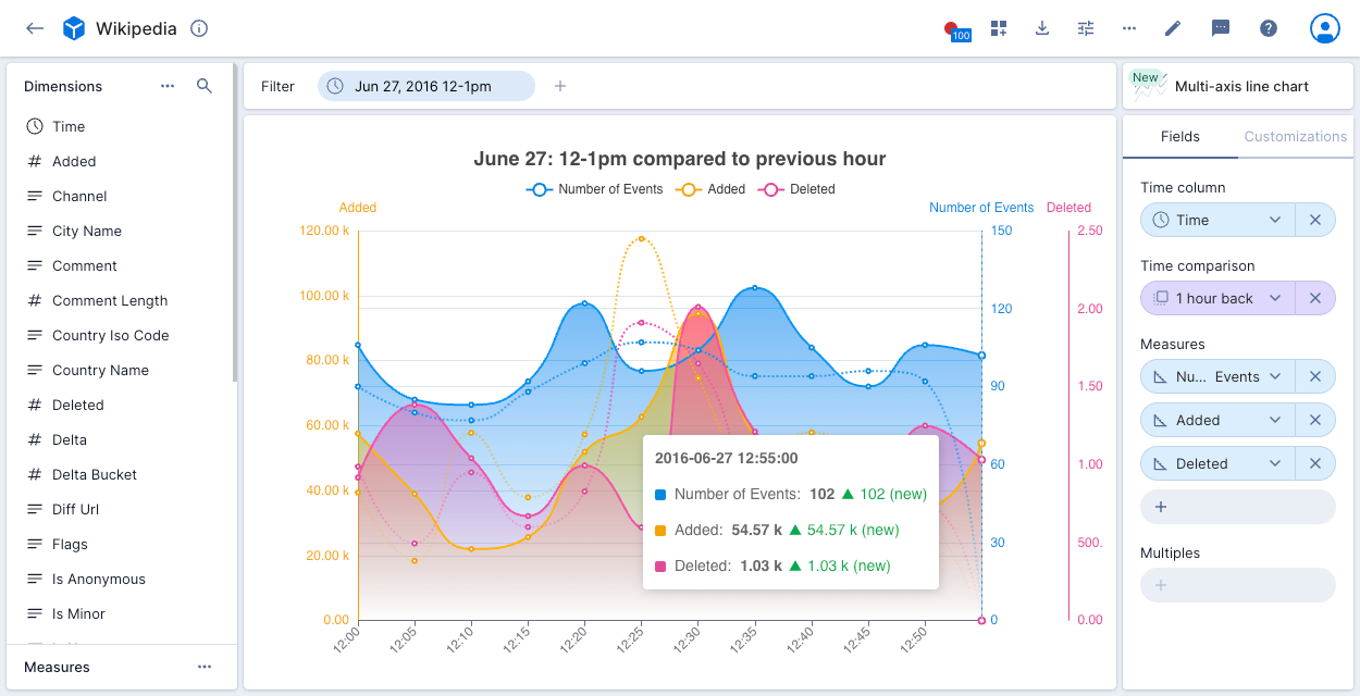
Multi-axis line chart
The multi-axis line chart visualization is designed to demonstrate trends over time. It's optimized for the display of multiple axes—you can display up to 10 measures on a single chart.
If you want to split the display of multiple measures into multiple charts, use the line chart visualization instead.
To enable this beta feature, contact Polaris support. Once enabled, you can continue to access the original line chart.
Set the following Fields in the visualization:
- Time columns: Time column and bucketing.
- Time comparison: Time comparison period for the measures.
- Measures: Select up to 10 measures to appear on the chart.
- Multiples: Set a multiple to group by a dimension. You can set a limit of up to 10 values and sort by measure or dimension. Note that you can either show multiple measure or show a groups dimension, not both.
You can also set the following options in the Customizations tab:
- Chart title: Set a title for the line chart.
- Color: Set colors for each line.
- Color fill: Select solid color or gradient.
- Interpolate: Select how to fill empty values.
- Axis alignment: Choose to display y-axes on the left or right of the chart, or use both sides.
- Points: Show or hide data points.
- Line style: Display a smooth, line, or step chart.
- Stack results: Stack the results if you've set Multiples to group by one or more dimensions.
- X axis: Add an axis title and select a label orientation.
- Y axis: Label each line, set the precision, select a label orientation, set a maximum axis value, set a scale interval between tick marks, set a scale type, and select a format (Polaris inherits the format from the measure by default).
The following example shows the Number of Events, Added, and Deleted measures for a one hour period in the Wikipedia data cube compared to the previous hour. A y-axis displays for each measure. Clicking the measure names at the top of the chart adds and removes them from the display. Clicking any point on the chart displays the relevant data.
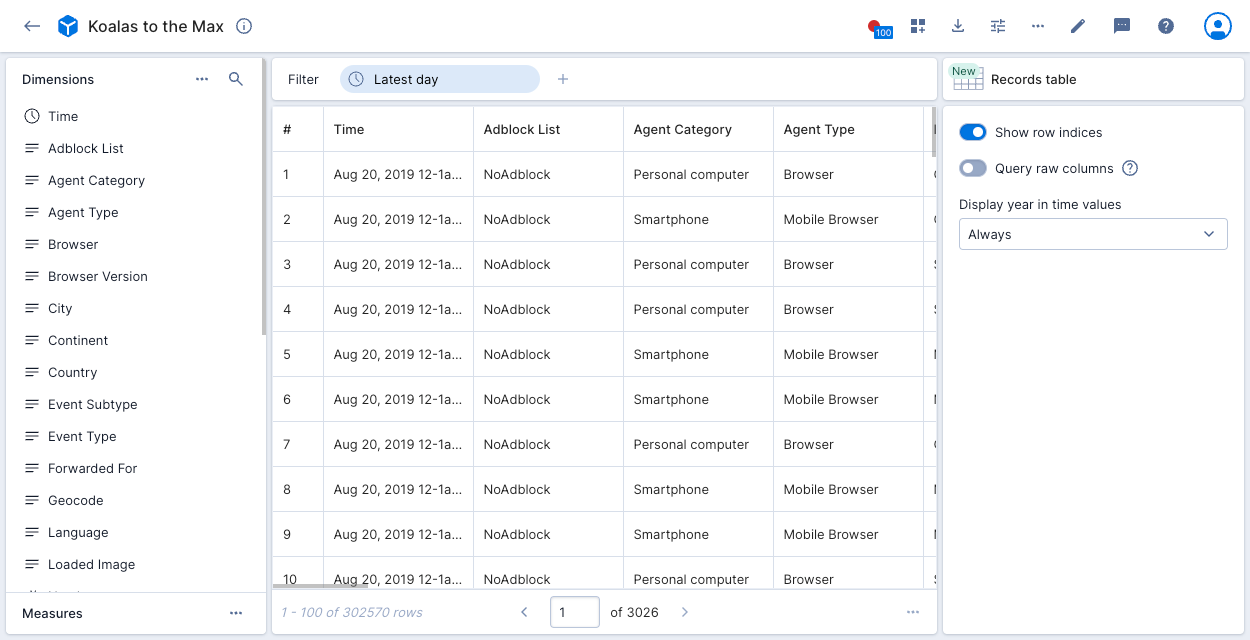
Records table (explore)
The records table (explore) visualization shows the raw data underlying the data cube, in table format.
To enable this beta feature, contact Polaris support. Once enabled, you can continue to access the original records table.
To use the records table (explore) visualization, click Records table (New) in the visualization selector. You can use the options panel on the right to show the row indices and display columns from the underlying data source instead of the data cube dimensions. If you don't select Query raw columns, you can choose whether to display the year in time values.
If you want to filter on data in the columns, use the records table visualization instead.
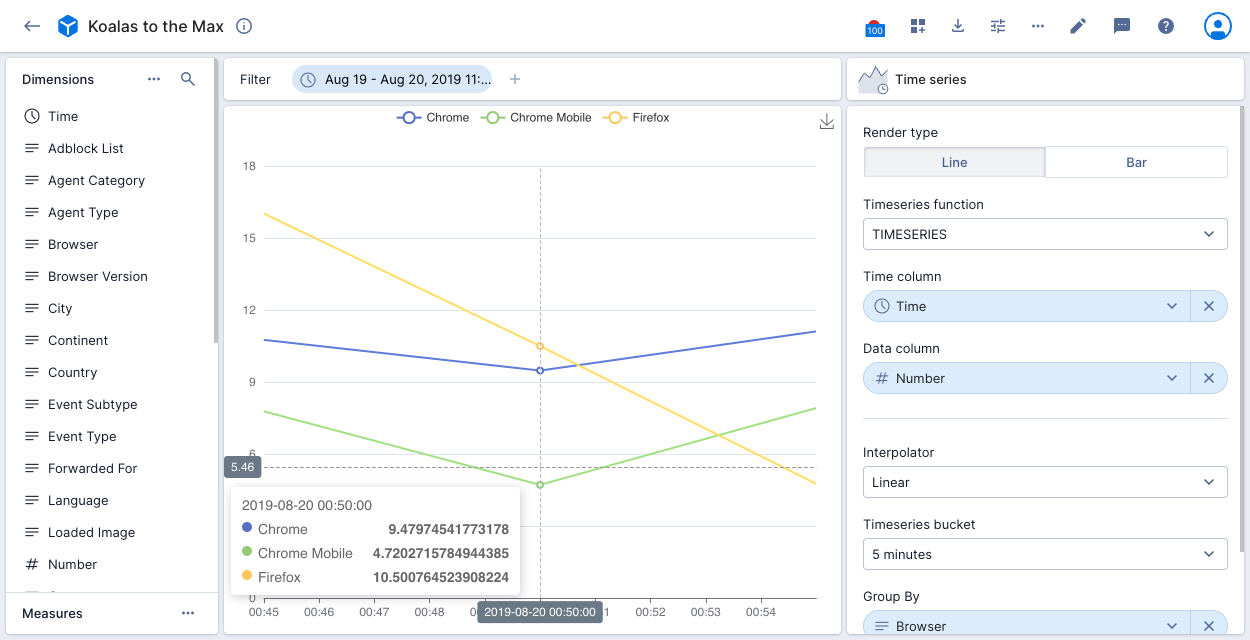
Time series
The time series visualization allows you to use time series functions to generate a line or bar chart showing the rate of change in your data.
Set the following Fields in the visualization:
- Render type: Line chart or bar chart.
- Time series function: Select TIMESERIES to create a time series of the data points or another time series function from the drop-down list.
- Time column: Time column to display on the x-axis.
- Additional Data columns: One or more columns Polaris applies the time series to—the columns Polaris displays depends on the selected function. Data columns display on the y-axis.
- Interpolator: You can specify the method to interpolate missing data points in the time series:
- Linear: Use linear interpolation to fill the missing data points.
- Padding: Carry forward the closest value in the series.
- Backfill: Carry backward the closest value in the series.
- Time series bucket: Choose a segment period for Polaris to use when calculating interpolation points.
- Group by: Column to represent as lines or bars in the visualization.
- Group limit: Limit to apply to the group column.
You can also set the following options in the Customizations tab:
- Color: Set colors for each line.
- Show legend: Display the legend for the visualization.
If Polaris displays a message that the selected window of times contains too many entries to display, adjust the filter to reduce the number of entries.
The following example visualization applies the TIMESERIES function to a Koalas to the Max data cube. The data is filtered to a specific period. The time column on the x-axis is Time, with Number shown on the y-axis. The data is grouped by Browser. The visualization displays the top three browsers with the largest number of events. There's a point on the chart for every 5 minutes as set in the time series bucket.
Other visualizations
This section provides descriptions and examples of the visualizations that are not explore type.
Overall
The default visualization is the overall visualization. See Overall for the explore version of this visualization.
Overall presents a numeric summary of selected measures with your specified filter criteria. You can select multiple measures and show a time range comparison. The following example shows the number of deleted events in the latest hour compared to the previous period:
If you create an overall visualization with a single measure, you can apply conditional formatting to color the visualization to indicate data severity.
Bubble chart
The bubble chart visualization lets you examine the relationship between two or three numeric variables. Each bubble in the chart corresponds to a single data point, and the measures for each point are indicated by the x-axis (the first measure), the y-axis (the second measure), and bubble size (an optional third measure).
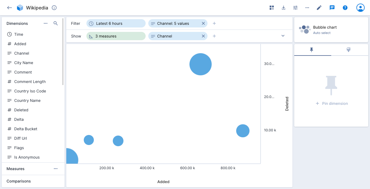
The following example shows a bubble for each of the five channels in the filter. The bubble's horizontal position notes the number of events added to the channel during the latest six hours, and the vertical position notes the number of events deleted from the channel during the same period. The bubble size indicates the relative comment length for the channels.
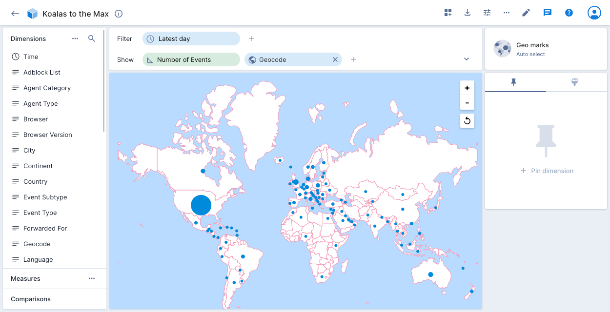
Geo marks
The geo marks visualization is the natural choice for dimensions that represent geographically encoded data. It can work with country encoded data. To use geo-oriented visualizations, modify the data cube configuration to make the country encoded data to be Geo type.
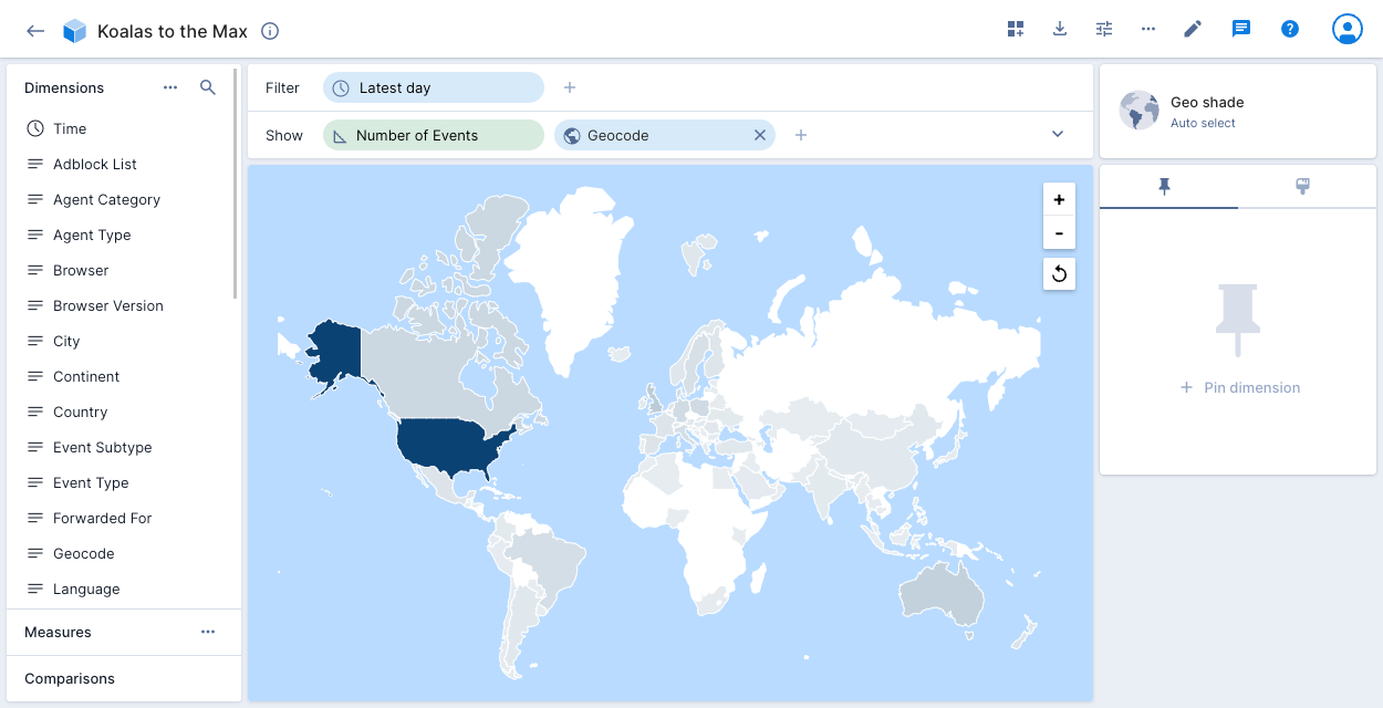
Geo shade
The geo shade visualization, also known as a Choropleth map, is another way to represent geographically encoded data. To use geo-oriented visualizations with country encoded data, set the data type to Geo in the data cube configuration settings.
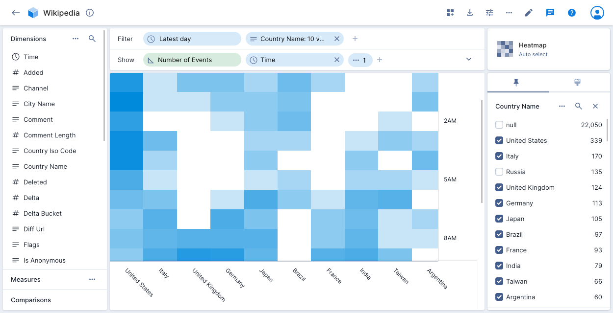
Heatmap
The heatmap visualization shows two dimensions as a matrix. The darker the cell color, the higher the number of events. This visualization works particularly well when one or both displayed dimensions are continuous.
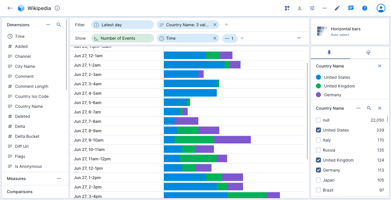
Horizontal bars
The horizontal bars visualization shows each dimension in horizontally oriented time buckets.
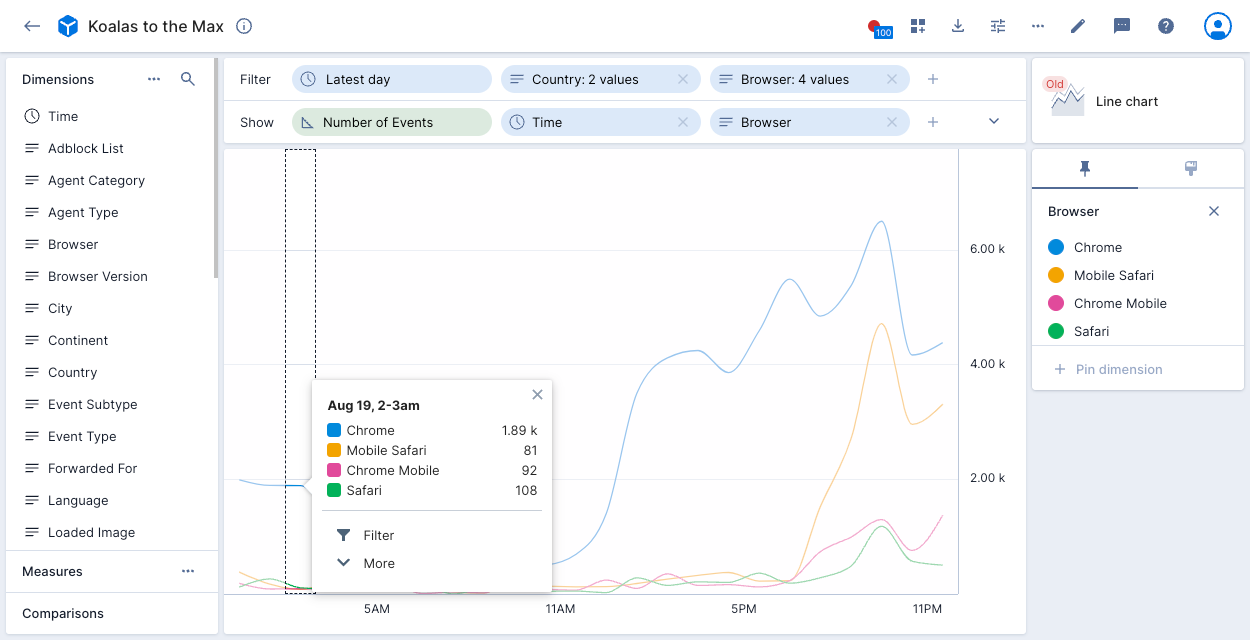
Line chart
The line chart visualization is designed to demonstrate trends over time. See Multi-axis line chart for the explore version of this visualization.
If you want to display multiple measures on a single chart, use the multi-axis line chart visualization instead.
The following example displays Number of Events and Browser for the latest day for two Country values and four Browser values. The data for the two selected countries displays as a single line for each browser.
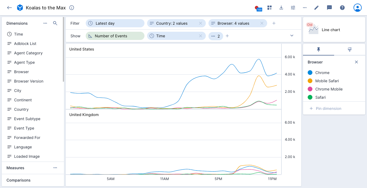
Adding Country to the show bar splits the display into two charts:
Markdown
You can use a Markdown tile to add formatted text to a dashboard. For more information, see the Dashboards overview.
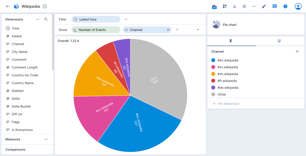
Pie chart
The pie chart visualization is a circular graph that shows dimension data as a proportion of a whole.
The following example displays the number of events for the top 5 Wikipedia channels for the latest hour. The grey Other slice represents events for all channels outside the top 5.
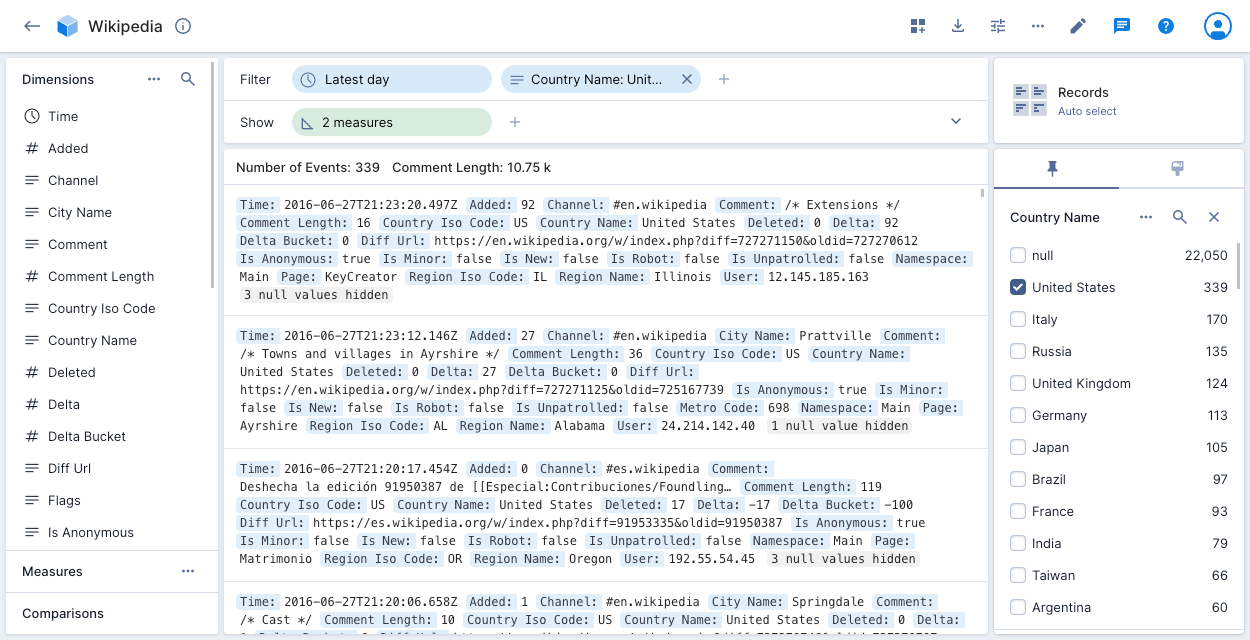
Records
The records visualization shows the raw data underlying the data cube, allowing you to see all dimensions that are in each record. This view can be useful for certain debugging issues. You can also view your records in groups for specific values of one or more dimensions by adding the dimensions to the show bar.
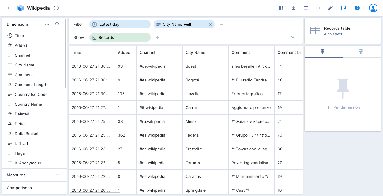
Records table
The records table visualization shows the raw data underlying the data cube, in table format. To filter the data, click any value in the table and select Exclude.
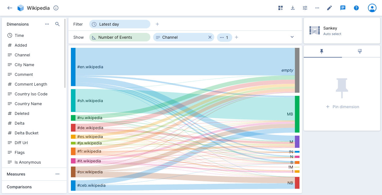
Sankey
The Sankey visualization shows the flow from one set of values to another. In Sankey diagrams, the width of each connection is proportional to the flow volume between the values.
Sparkline
In contrast to the line chart visualization that displays lines for multiple dimensions on a single chart, the sparkline visualization displays multiple line charts—one for each dimension.
The following example sparkline chart displays the number of events over time for five Country Name values:
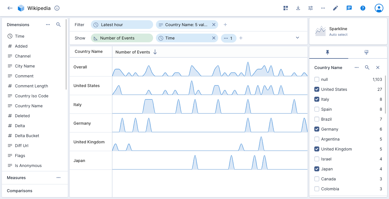
Hover over the first column heading—Country Name in the above example—to display the Swap axes icon. Click the icon to swap the splits assigned to the axes.
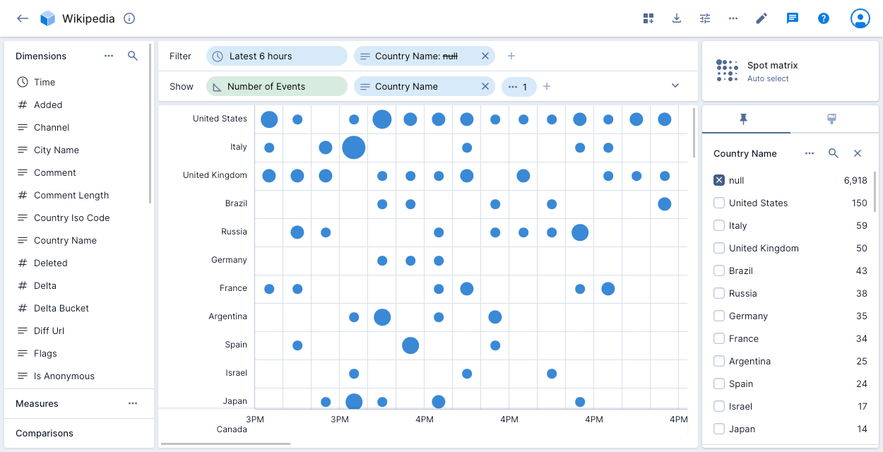
Spot matrix
The spot matrix shows the distribution of events on a two dimensional matrix using circles, with larger circles representing a greater number of events.
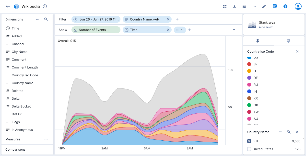
Stack area
The stacked area chart lets you see the overall trend in the data, while also showing the contributions of individual dimensions. Unlike the line chart, the area chart lets you see the total of the values added together.
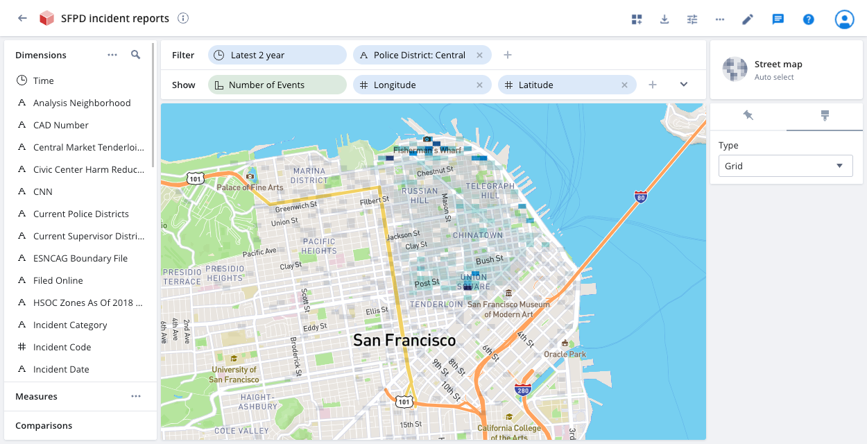
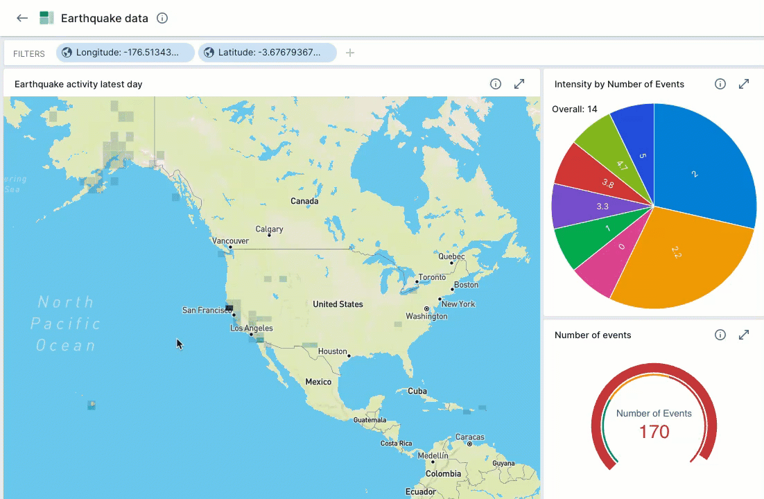
Street map
If your event data contains latitude and longitude coordinates, you can use the street map visualization to pinpoint events to precise locations on a map.
Create dimensions for your latitude and longitude data. Add the dimensions to the show bar and select Street map from the visualization selector on the right side of the page.
You can click the paintbrush icon to change the default Grid display to Blobs for a circular representation of the data. The darker the grid or blob color, the higher the concentration of events at that location. Click anywhere in a grid or blob to see the corresponding latitude and longitude coordinates and the number of related events. Click Filter to filter the event display by specific latitude and longitude coordinates.
When you add a street map visualization to a dashboard, the latitude and longitude filters apply to the entire dashboard. As you scroll in and out on the map, Polaris updates all of the dashboard tiles to reflect the updated latitude and longitude filters.
For example, the following screen capture demonstrates zooming in on a map to show earthquake activity in California. The Intensity pie chart and the Number of events gauge automatically update to reflect the data displayed in the map view.
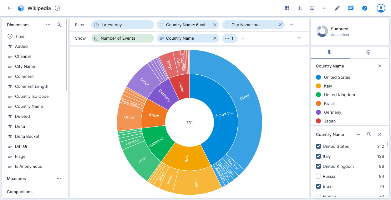
Sunburst
The sunburst, also known as a donut or a pie chart with one split, is a visualization that represents the ratios between the values of a dimension. When rendering multiple dimensions, each is subdivided to show proportional representation.
Table
The table visualization presents a table view of the data with formatting that helps you to visualize measure magnitude. See Flat table for the explore version of this visualization.
The table visualization can show multiple dimensions or measures as columns.
For columns that contain URLs, hold Cmd (or Ctrl) and click the URL to open it in a new tab.
The following example shows the number of Wikipedia events for City Name London or New York by Channel for the latest 6 hours, with a comparison to the previous period:
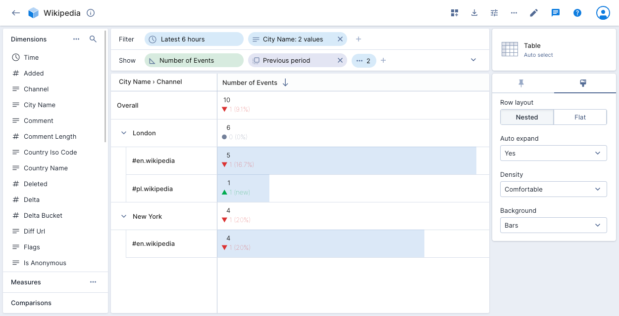
When you apply a time comparison, only Sort by Current Value shows new items. Sort by Previous Value, Sort by Delta, and Sort by Percentage hide items that don't exist in both periods, which can mask new spikes or anomalies.
Click the paintbrush icon on the right to access layout options. Polaris displays a nested layout by default—shown above. Click and drag the dimensions in the show bar to rearrange their order and change the nesting.
Hover over the first column heading—City Name > Channel in the above example—to display the Swap axes icon. Click the icon to swap the splits assigned to the axes.
Select the Flat row layout to display a column for each dimension, or use the flat table visualization to create a pivot table.
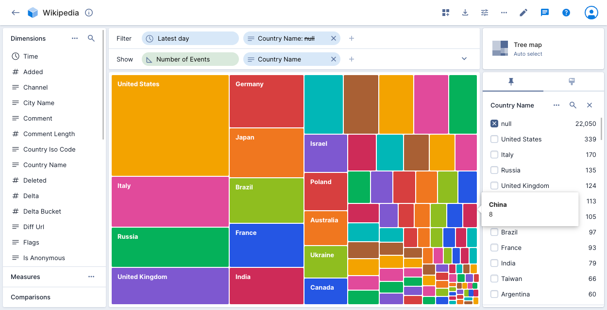
Tree map
The tree map visualization shows how the values of a dimension combine to make up the whole. It's particularly suitable for hierarchical dimensions.
Vertical bars
The vertical bars visualization displays dimensional data as vertical bars. See Bar chart for the explore version of this visualization.