Visualize data
After you set up data cubes and dashboards in Imply, data users can start using visualization features to explore and draw insights from their data.
Exploring data overview
Imply provides users with easy-to-use tools for exploring data and data patterns. Here is a sample data exploration path to acquaint you with these tools.
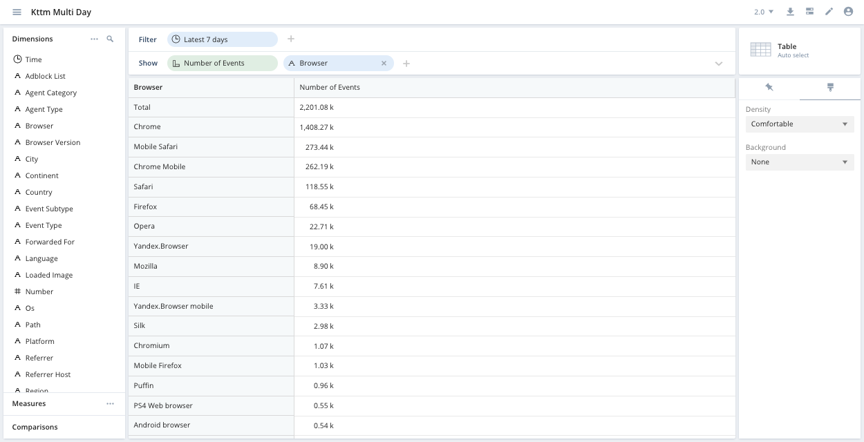
Given the Koalas to the Max sample data, suppose that you want to know which browser was most popular in the past week. Change your filter to latest week and drag the Browser dimension into the show bar. You can now see that Chrome was the most frequently used browser:
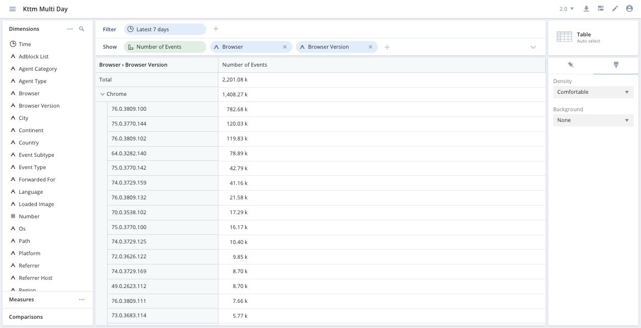
You can drill down to see the number of events per browser version for each browser:
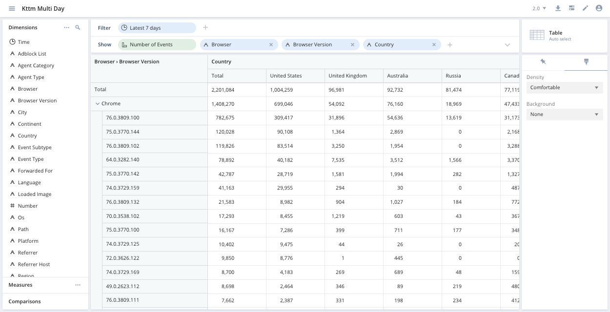
Next, suppose you want to break down this data by country. You can create new columns for each country by dragging the Country dimension into the Columns field in the show bar. To add a column, click the show bar's drop-down menu icon so that the Columns row of the show bar appears.
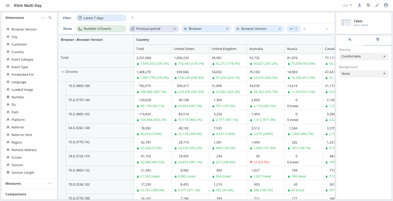
To see whether these results are typical or how they change over time, use the comparisons feature. To compare this week to the previous one, drag Previous period in the Comparisons section of the left sidebar to the show bar:
Access a data cube
To access a data cube, click the name of the data cube in the left column of the Imply home page.
Filters
In the data cube view, notice the filter bar at the top. You can filter by a dimension or measure and refine the results further by selecting a filter method:
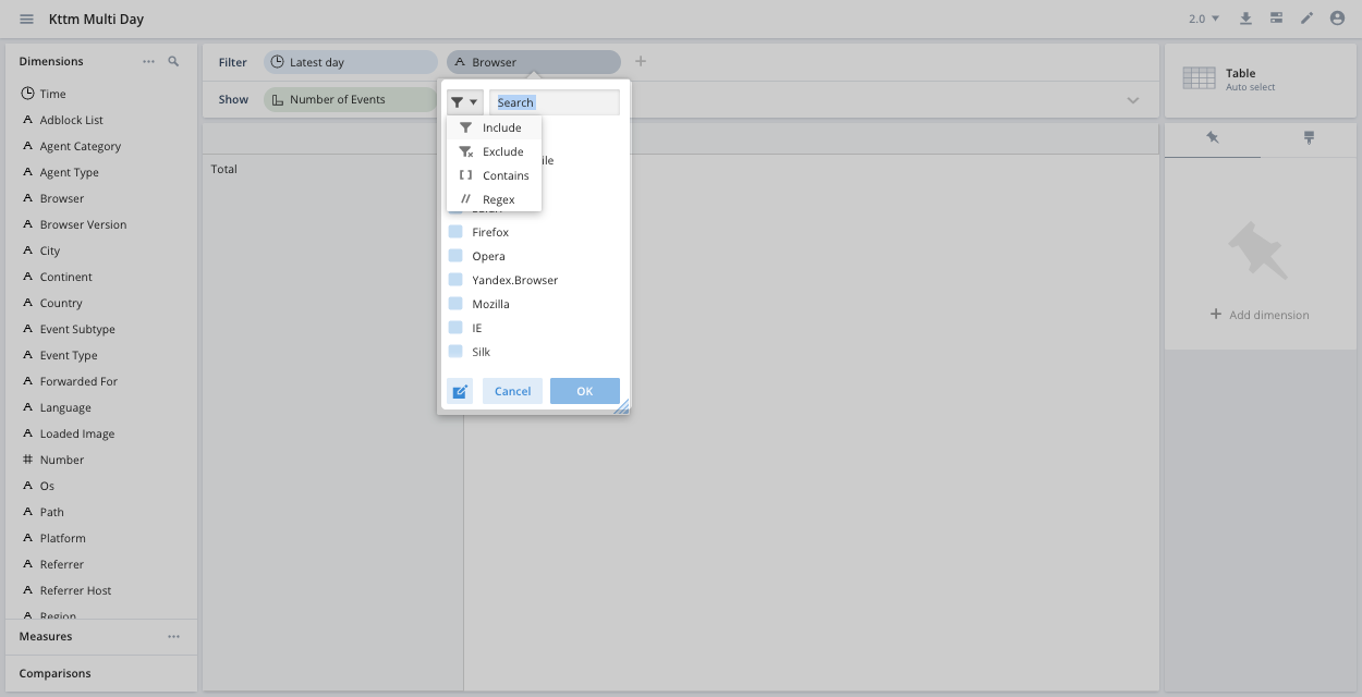
The filter methods are as follows:
- Include: Includes the selected value.
- Exclude: Excludes the selected value.
- Intersect: Includes all selected values. Applies to multi-value dimensions only.
- Contains: Contains the specified text.
- Regex: Matches the specified regular expression.
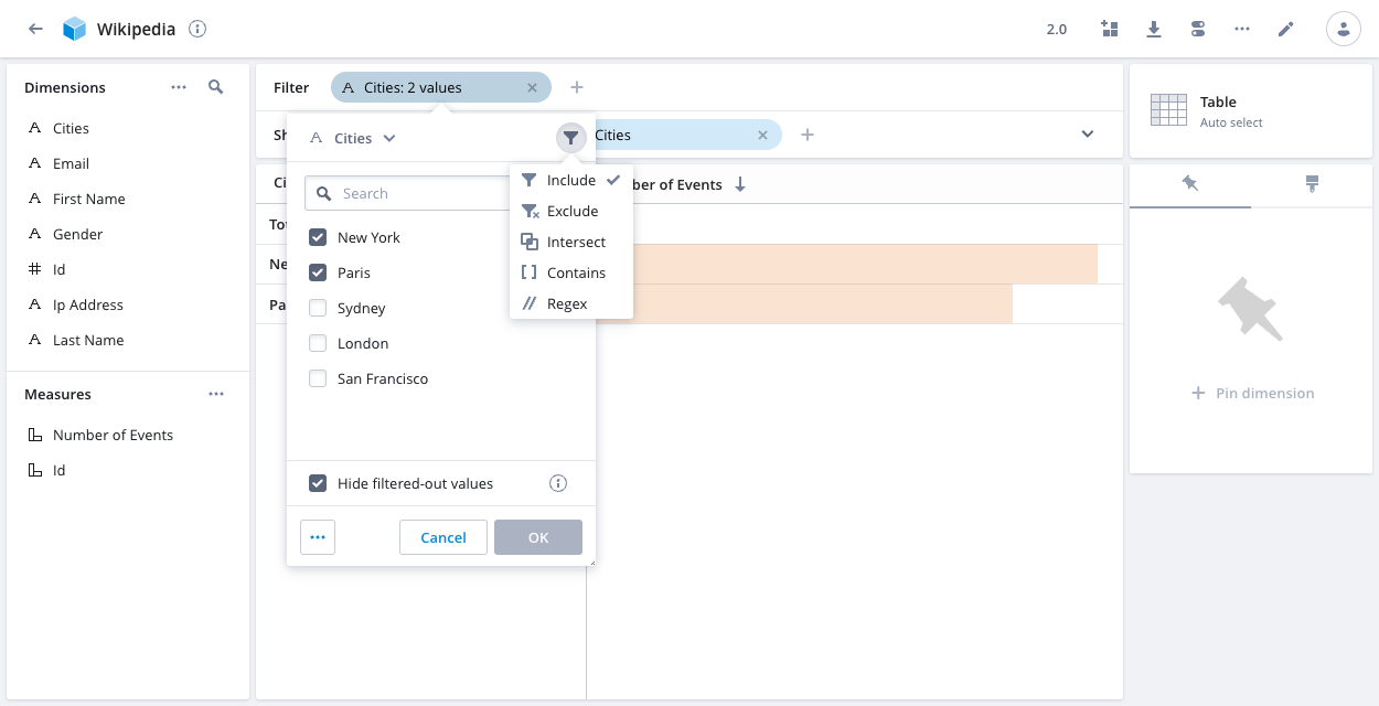
Multi-value dimensions
If you filter on one or more values in a multi-value dimension and select Include or Intersect, only your selected values appear in the results. Uncheck the box Hide filtered-out values to display all values.
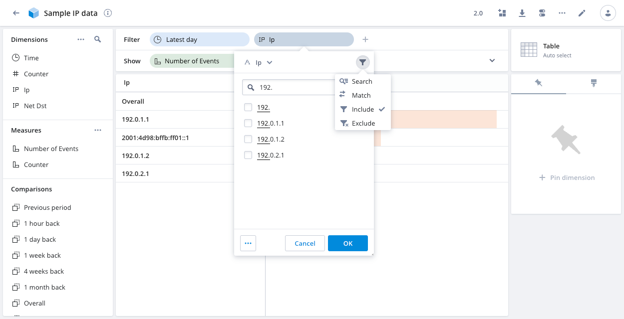
IP dimensions
If you filter on an IP or IP prefix dimension, the following filter methods are available:
- Search: Search for a single IP address or an IP prefix.
- Match: For an IP dimension, enter a complete IP prefix—for example,
192.0.1.1/16.
For an IP prefix dimension, enter a complete IP address—for example,2001:db8:3:4:5:6:7:8. - Include: Start typing an IP address or IP prefix. Polaris displays matching values and you can select one or more values to include.
- Exclude: Start typing an IP address or IP prefix. Polaris displays matching values and you can select one or more values to exclude.
Relative time filters
By default, relative time filters are inclusive of the start bound and exclusive of the end bound. For example, a filter on March 16 3-4 PM includes the following range by default:
2023-03-16T15:00:00.000Z - 2023-03-16T15:59:59.000Z.
You can override the default in a data cube, in a dashboard and in individual dashboard tiles. The following screenshot shows the setting when applying a time filter to a data cube:
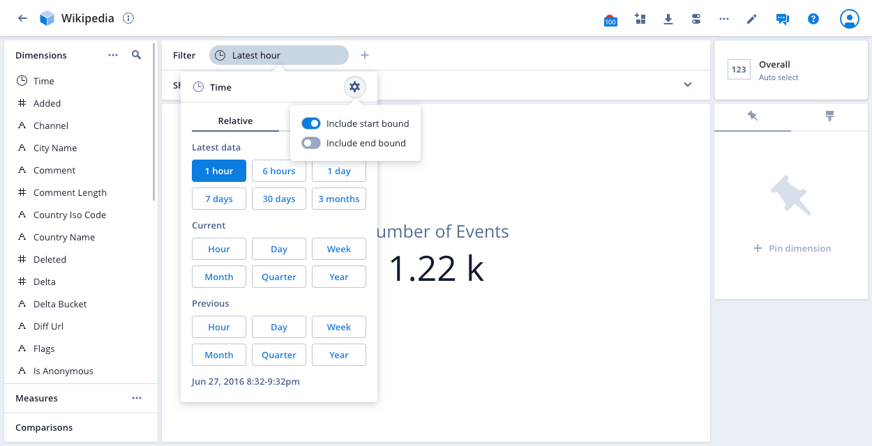
You can include or exclude the start and end bounds of the filter.
Nested columns
If your data cube contains nested data, you can filter on the nested data. The following example filter displays products with color olive in the nested Details column:
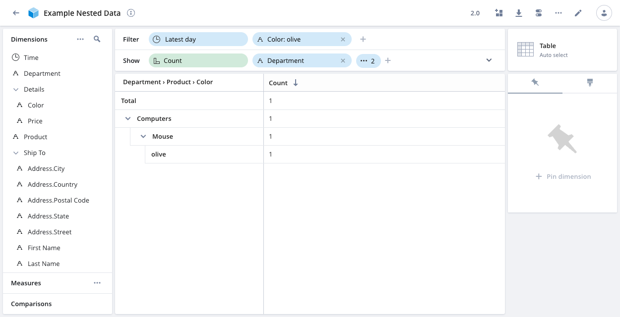
See Nested data for information on ingesting nested data.
Dimensions and measures
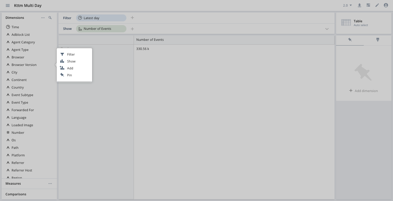
Add dimensions, measures and comparisons that you want to see to the show bar under the filter.
The left sidebar contains all of the data cube's dimensions and measures. You can add any of them to a visualization by dragging them to the show bar. Alternatively, you can click on anything in the left sidebar and select an option:
Visualizations
Use the Visualize menu on the right side of the page to select the type of visualization you want to use:
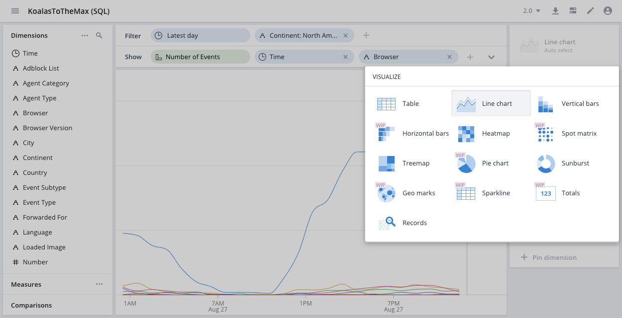
For a description of each of the visualization types, see the Visualizations reference.
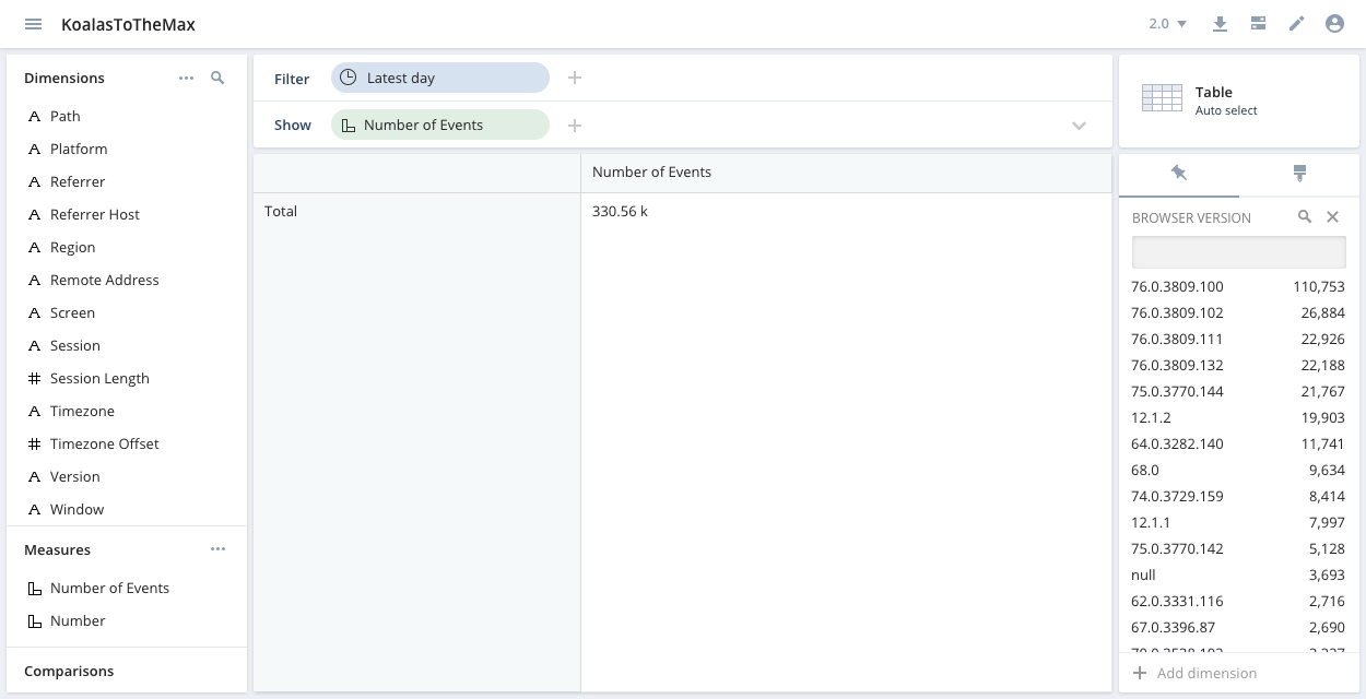
Pin a dimension
Use the pinboard panel at the right to pin a dimension and quickly filter the view based on values of that dimension.
Format a visualization
Use the paintbrush icon to format certain aspects of your visualization. The paintbrush formatting options change depending on your visualization type. In the table view, for example, you can add bars or a heat map to help show how much your table's rows differ.