Managing dashboards
A dashboard is made up of visualizations of one or more data cubes.
Pivot users with AdministerDashboards can create, edit, and manage dashboards. Users with ChangeDashboards permissions can create dashboards or modify dashboards unless restricted by individual dashboard restrictions.
Create a dashboard
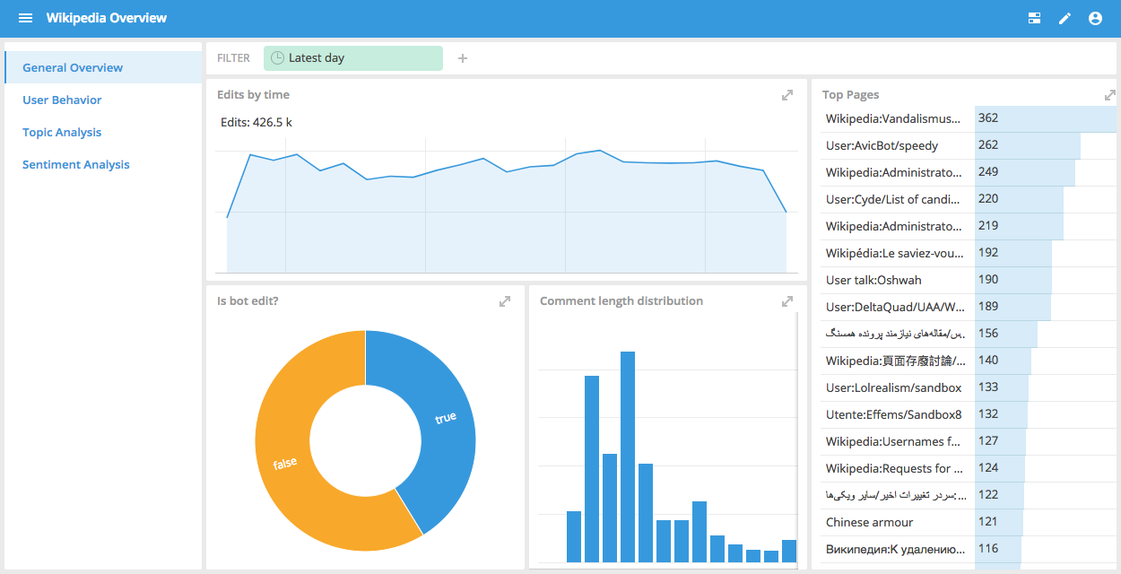
You can create a dashboard from a data cube or from the Pivot home page. You can position and size the individual tiles in any way that you want. A dashboard lets you see the data from all its views, or tiles, on a single screen.
For a step-by-step guide to creating a dashboard, see Creating dashboard tutorial information
Edit a dashboard
To edit a dashboard, click Edit in the dashboard header. When the dashboard is in edit mode, you can add, rearrange, rename, and delete the views. You can also change the dashboard settings—for example, you can adjust the color theme and modify sharing permissions.
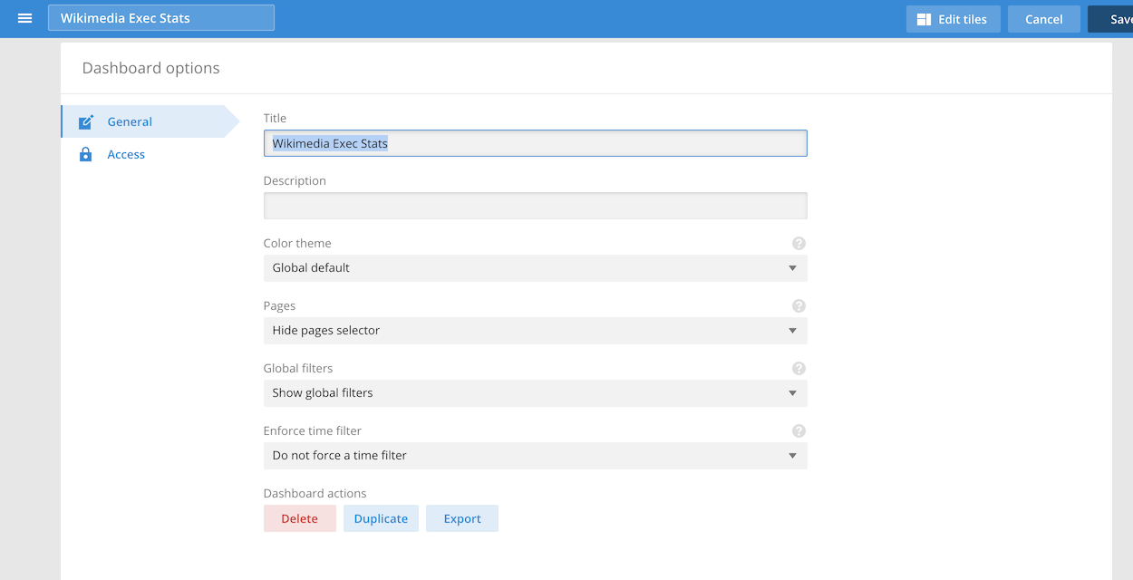
To display the Dashboard options, click Options in the header bar.
You can also edit a dashboard from a data cube. Navigate to a data cube and click the Add to dashboard icon, then select the dashboard you want to edit.
Export and import dashboards
Pivot lets you export and import dashboards as JSON objects.
To export a dashboard, open the Dashboard options. From the General tab, click Export. The dashboard downloads to your designated downloads directory.
Importing dashboards requires the ConfigureLookAndFeel privilege.
To import a dashboard, follow these steps:
In the top right corner of the page, click the user menu icon.
Click Settings > Advanced.
Click Import dashboard. The following dialog box appears:
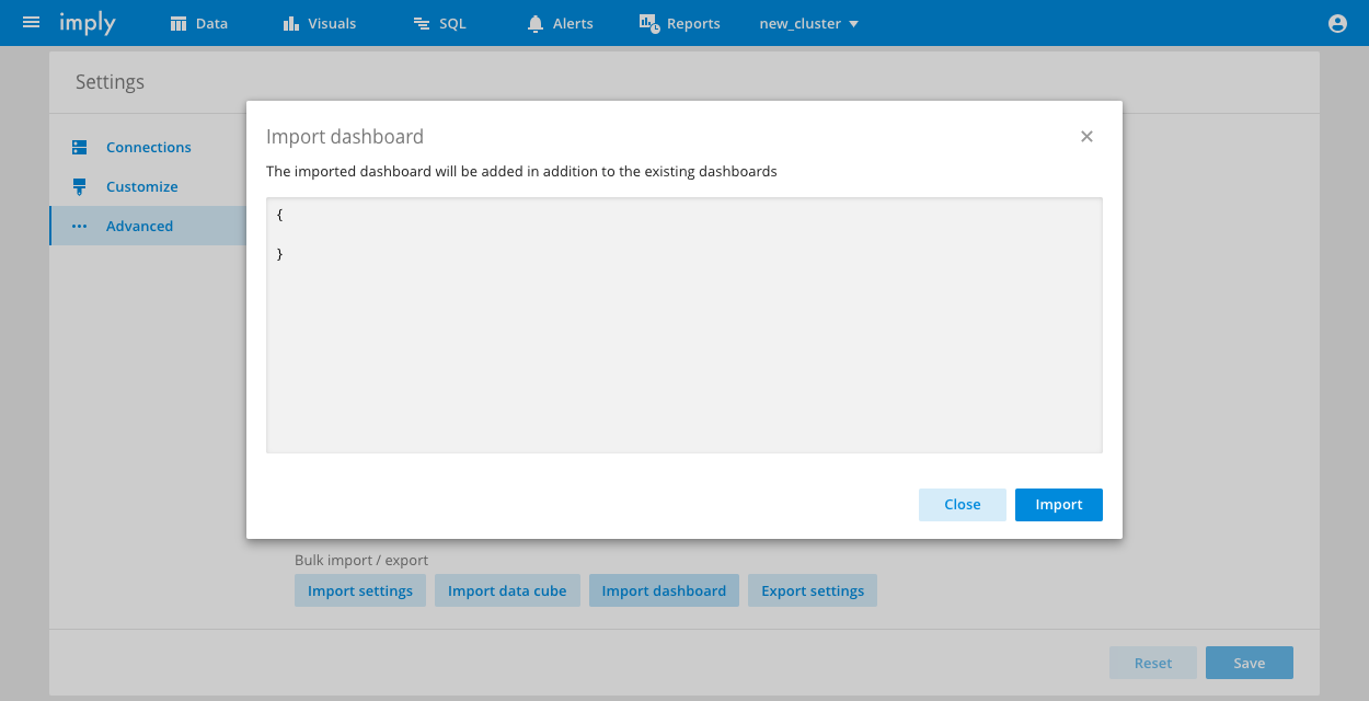
In the dialog, paste the JSON object for the dashboard you want to import and click Import.
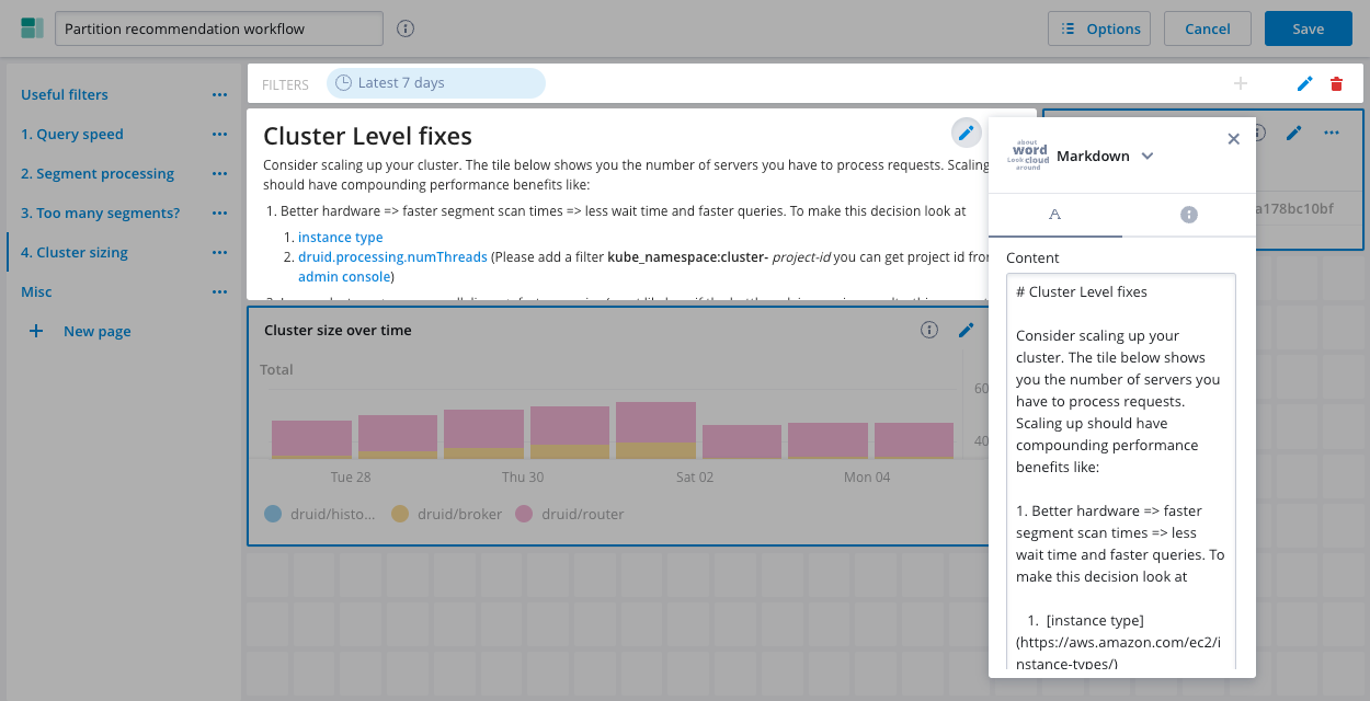
Add text to a dashboard
You can use a Markdown tile to add formatted text to a dashboard. To do this, add a new tile to a dashboard and select Markdown from the list of visualization options.
The Markdown tile supports the features in react-markdown version 5, and the additional features in the remark-gfm plugin.
For a description of available visualization options, see the Visualizations reference.
Access control
You can define access permissions for each dashboard. The access settings are in the Access tab of the Options panel. See Access Control for more information.
Conditional formatting
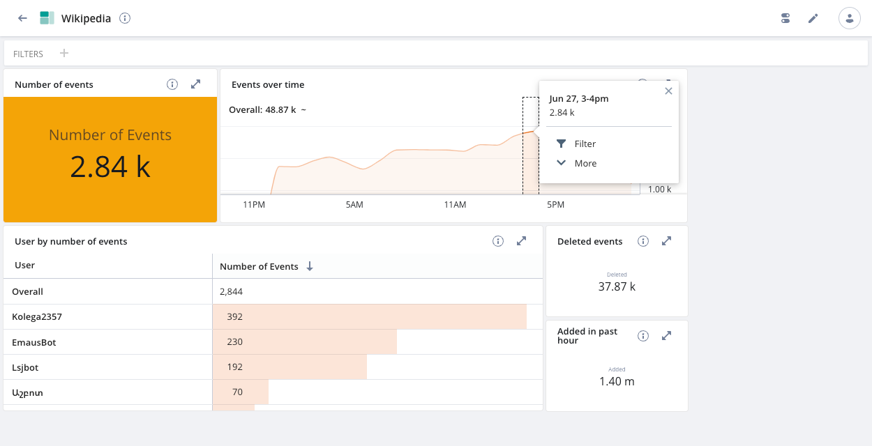
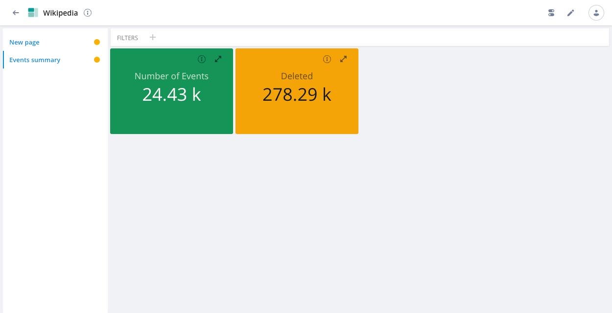
If you create a dashboard tile for an Overall visualization with a single measure, you can apply conditional formatting to color the visualization as an indication of data severity—green for ok, amber for warning, red for critical. See the Visualizations page for information on how to set this up.
As you interact with the tiles in your dashboard, the tile with conditional formatting updates to show the severity of the selected data, as illustrated in the following screenshot:
Dashboard pages
Pages let you group multiple dashboard views into a single dashboard, so that any user can easily switch between them:
To create a page, go to Edit > Options > General > Pages and select Show page selector. Click Save. Then edit the dashboard again, and click New page.
If you add an Overall visualization tile with conditional formatting to a dashboard page, the colored icon next to the page name indicates the severity of the data on the page. If multiple severity colors display on the page, the icon color reflects the most serious severity level, as shown in the following screenshot:
Dashboard tile options
Each tile menu contains additional settings. You can change the tile's visualization type in the Content field, specify the Data cube it comes from, add a Filter, and more. For example, under Visualization options, you can remove axes labels in some types of visualizations by unchecking Show axes if possible.
Dashboard options
Click the options icon in the top navigation bar to set the following dashboard options:
- Timezone: Set the dashboard’s timezone.
- Query cache: Enable or disable the query cache for all dashboards and data cubes. The cache setting persists until you reload the page. The cache optimizes query performance, but can cause results to be slightly out of date—especially for stream-ingested rolled-up datasources.
- Refresh rate: Set the rate at which data in the dashboard refreshes.
- Monitor queries: View the underlying queries Pivot makes when you’re working with the dashboard. You must enable the query monitoring feature first.
Create a link to a dashboard
You can create a URL that links directly to a Pivot dashboard. See Query parameters reference for information on the query parameters Pivot supports in the URL.