Explain
Explain is an alpha feature that should be considered preview and subject to change or removal at any time. Alpha features are provided "as is," and are not subject to Imply SLAs.
Explain allows you to select a section of data and receive automated, machine-driven explanations of detected characteristics and patterns in the selected data.
On a line chart you might see a spike, a dip, a rise, or a fall. Explain can help you figure out which values in which dimensions are responsible for the observed trend.
Clicking the star button in the highlight menu activates the Explain feature.
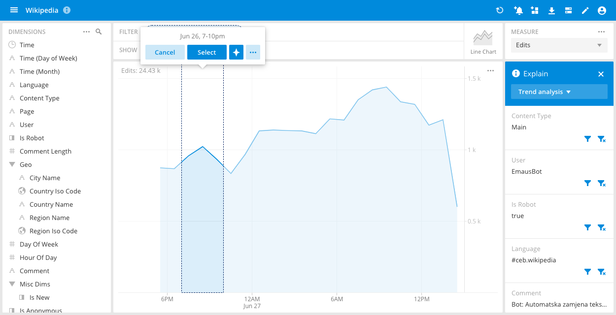
After selecting a feature of interest (a spike in the above example), a series of explanations are presented with possible actions.
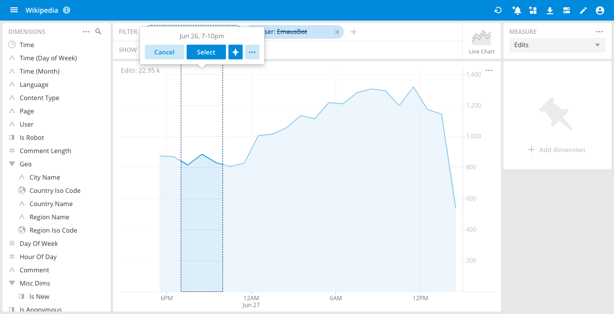
In this case, we can exclude the user Bearcat and immediately see that the selected spike disappears.
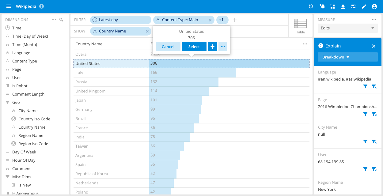
Explain is not limited to the line chart. You can select any slice of data of interest and receive a list of driving factors.
Explain also has a specific mode for time comparisons, in which Explain analyzes the difference between the current values and compared values.

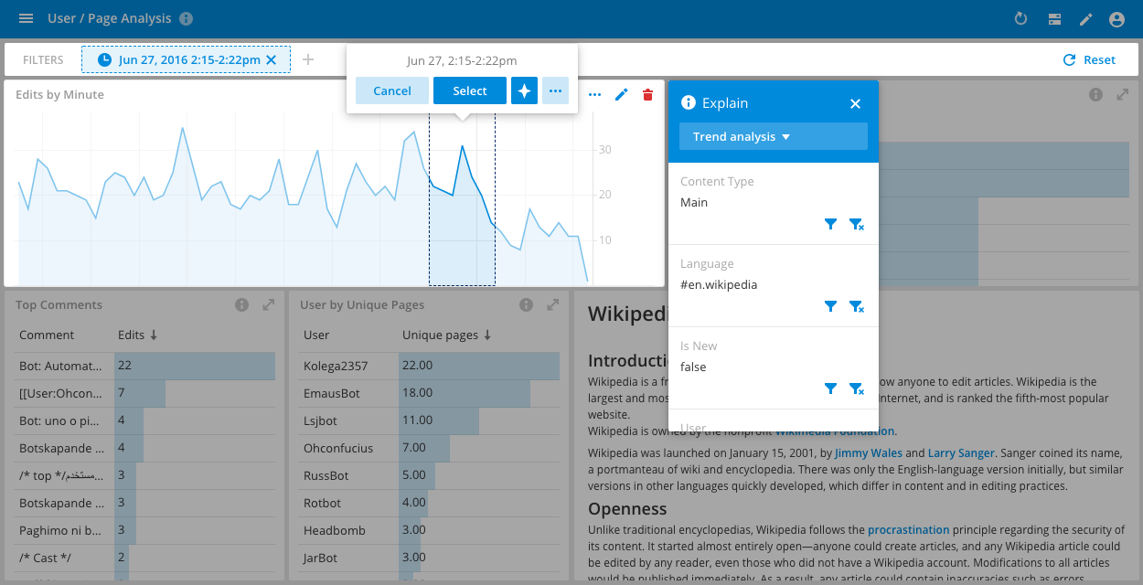
Similarly, in a dashboard, selecting a section of data and clicking on the star button activates the Explain feature.
Explain is domain-agnostic, that is, it builds a model of your data on the fly, when activated, and can therefore be used within any filter.
There are three algorithms underlying Explain:
- Change compare - Suitable when a comparison is chosen. It compares and finds the contributing factors in the current value versus the comparison. Change compare is automatically chosen when compare is selected.
- Trend analysis - Suitable when selecting a trend, such as a spike, dip, rise, or fall. It automatically detects the trend and then finds the contributing factors.
- Breakdown - Suitable when selecting a singe slice of data (without specific reference). It finds the contributing factors to the selected slice.
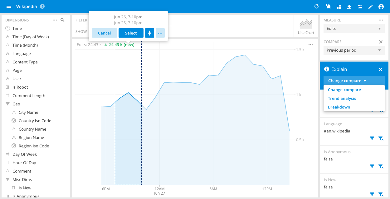
The appropriate algorithm is automatically chosen given the selected data and other factors, such as the filters and whether a comparison is used.