Time comparisons
You can use Pivot to see the current trend of data compared to data from a previous period.
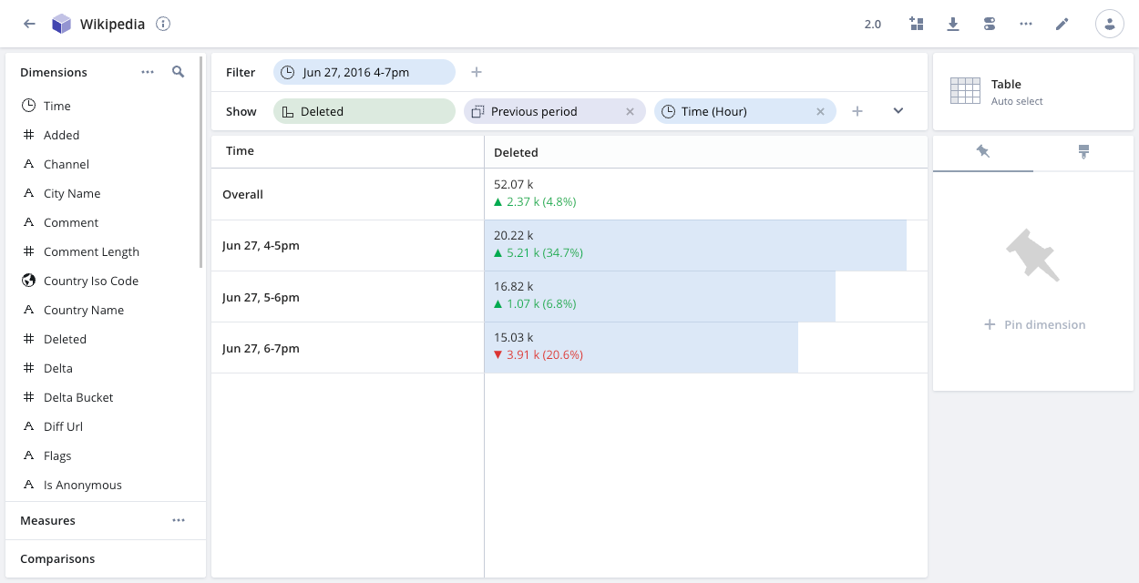
Once you select a reference time period to compare against, Pivot adds delta indicators to the displayed measures to show the change.
The following example shows the number of Wikipedia entries deleted between 4 PM and 7 PM on June 27, compared to the same time period during the previous day:
Add a comparison period
To add a comparison period to a data cube, click the expand arrow on the right side of the Show bar and click the plus icon in the Comparison row.
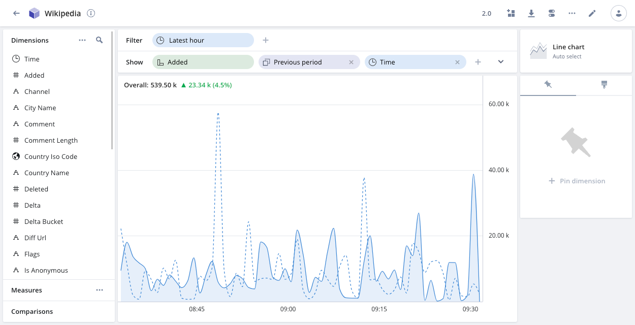
The following example line chart shows Wikipedia entries added during the latest hour, compared to the previous period—the previous hour. The blue dotted line shows the historical data, providing context to the blue line, which is the time period being analyzed.
You can add time-compare visualizations to a dashboard to provide a visual overview of relative performance.
Create custom comparison periods
You can create custom comparison periods that appear in the Comparisons drop-down when you're exploring a data cube. See Managing data cubes for more information.
Comparsion period examples
Most of the time periods in the Comparison drop-down are self-explanatory. The following examples illustrate how Pivot takes the different lengths of the months into account when determining comparison periods.
Previous period
Pivot calculates the previous period duration by using the current time filter. Pivot shifts the start time of the comparison period based on the calculated duration.
For example, if the time filter is set to Current month and the current month is May, the previous period duration is 31 days. The start of the comparison period is 31 days before May 1—that is, April 30.
1 month back
Pivot looks for the date in the current time filter in the previous month. If that date doesn't exist, Pivot uses the closest valid date. For example, if the current time filter is May 1 - May 31, Pivot looks for April 31. That date doesn't exist so Pivot uses the comparison period April 1 - April 30.
Learn more
See Relative time filters for information on how relative time filters work.