Create a dashboard
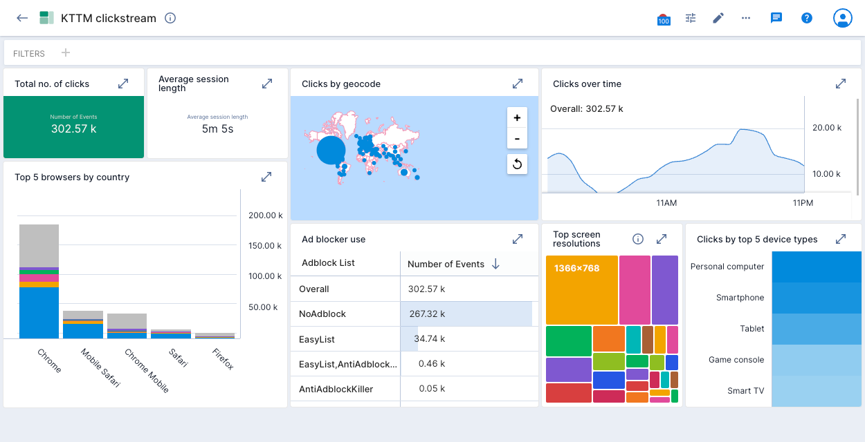
This tutorial walks you through the steps to create a dashboard called KTTM clickstream, illustrated below:
If you are new to Polaris, start by completing the Polaris quickstart. The quickstart shows you how to sign up for an account and create a data cube. In this tutorial, you follow the same process to create a new table and a new data cube containing geographical data. You then use that geographical data to create your dashboard tiles.
Prerequisites
Before you complete this tutorial, ensure that you have the following:
A Polaris account. You can sign up for a free trial at Imply Polaris - Sign Up.
You must belong to the Organization Admin or the Project Admin group or have the
AdministerDashboardspermission assigned to you. To learn more about permissions, see Permissions reference.
Create a table
To create your table, follow the steps in the Polaris quickstart to load data with the following differences:
- Download this clickstream activity file instead of the file linked to the quickstart.
- Name the table “Koalas Geo”.
- Select the
kttm-replace.json.tar.gzfile you’ve downloaded, to ingest. The upload time will vary, depending on your network speed.
Create a data cube
To create your data cube, follow the steps in the Polaris quickstart to create a data cube. When prompted, select the Koalas Geo table as your data source.
Edit the Geocode dimension
Before you can use the Geocode dimension to create dashboard tiles based on geographical data, you need to set its type:
Open your data cube and click the ellipsis in the Dimensions sidebar. Click Edit dimensions.
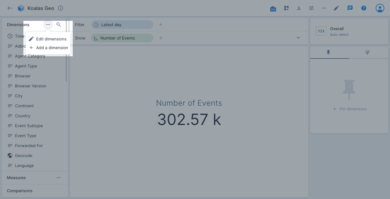
Click the pencil icon next to the Geocode dimension to edit it.
Change the Type to Geo and the Geo encoding to ISO 3166-1 Alpha-2.
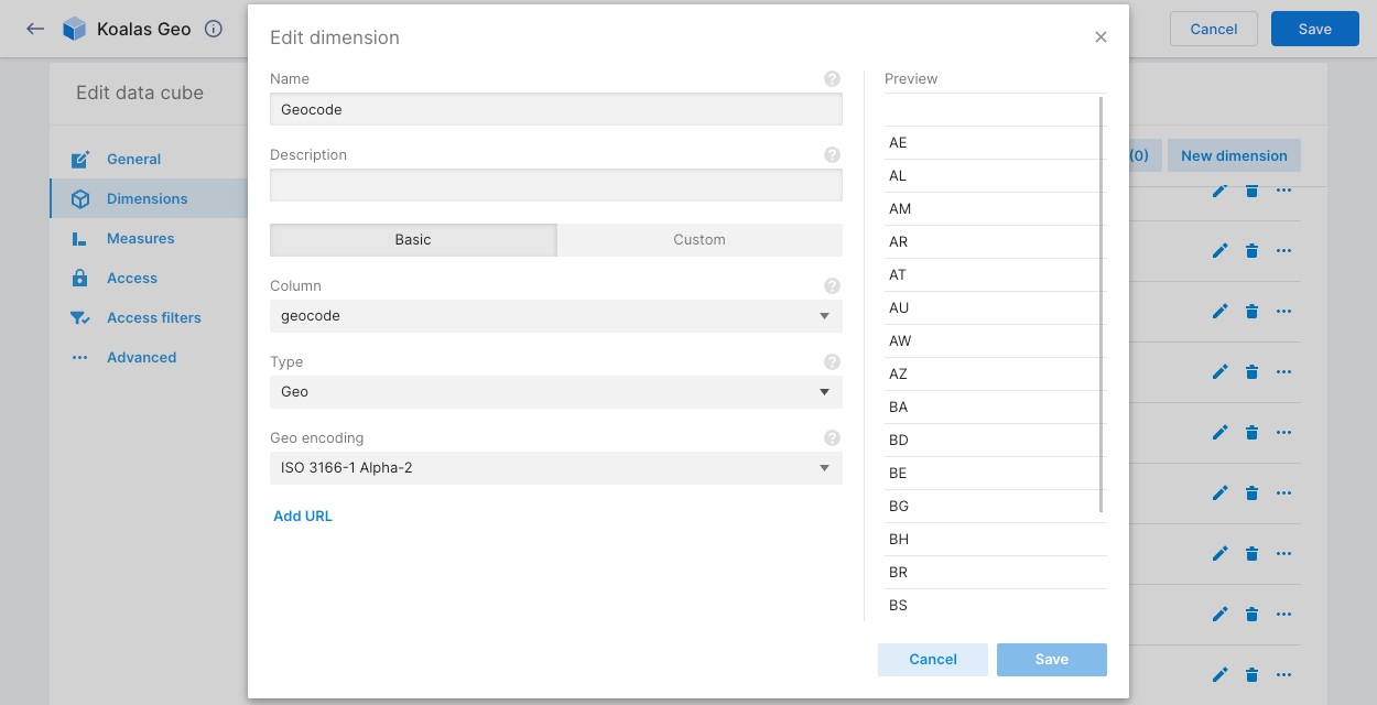
Click Save.
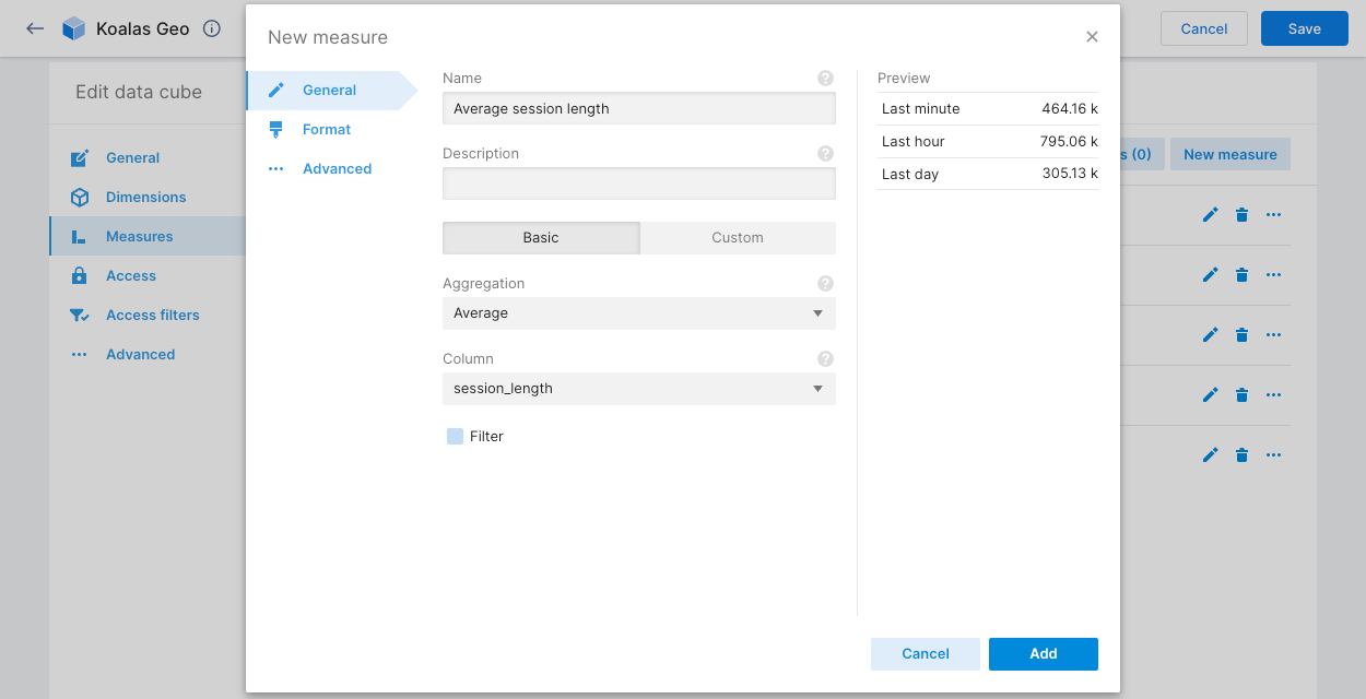
Add a custom measure
The Average session length tile requires a custom measure in your data cube to calculate the average session length. Create it as follows:
Open your data cube and click the ellipsis in the Measures sidebar. Click + Add a measure.
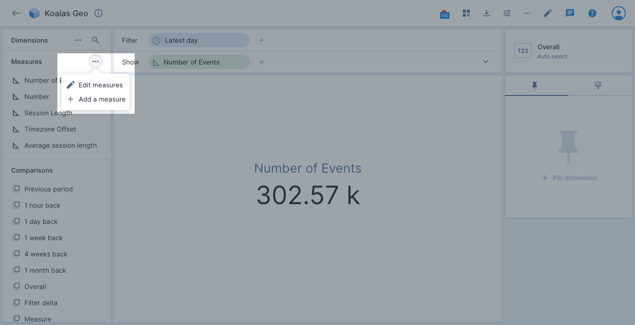
Type "Average session length" in the Name field.
Select Average in the Aggregation drop-down and session_length in the Column drop-down.
Click Format and change the Abbreviation to Duration Text.
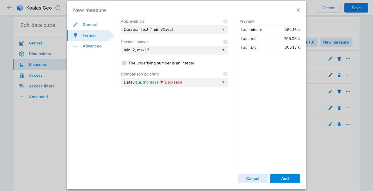
Click Add and then Save.
Create a dashboard and an initial tile
You must build a dashboard one tile at a time. In a data cube, start by creating a view that you want to add to your dashboard. For example, the KTTM clickstream dashboard includes a tile for the total number of clicks (events) that you see when you open your Koalas Geo data cube.
To add a tile:
Open your Koalas Geo data cube.
Click the Add to dashboard icon in the top navigation panel, then click + Create new dashboard. Close the edit window.
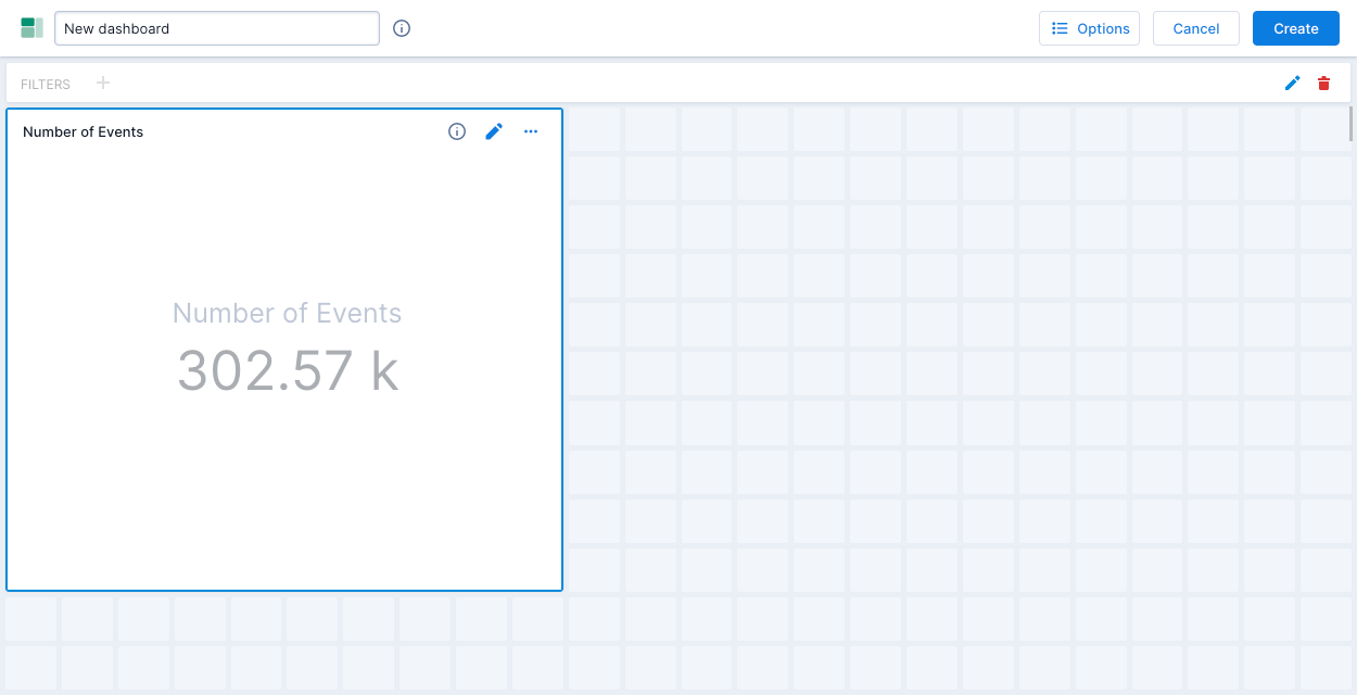
Now that you’ve added your first tile to a new dashboard, title the dashboard by replacing "Unnamed dashboard" with "KTTM clickstream."
Click the Edit icon in the Number of Events tile to open the tile menu.
Click the Info icon and in the Title field, enter "Total # of clicks."
The tile menu contains additional settings. For example, you can use the drop-down at the top to change the tile’s visualization type. You can click the cube icon and use the drop-down to select a different data cube. You can also add a filter, and more.
Close the edit window and click Save to save your new dashboard.
Create additional tiles
You can add as many tiles to your dashboard as you want. This section explains how to recreate the tiles in the KTTM clickstream tutorial dashboard using the Koalas Geo data cube. All tiles use the Latest day filter in addition to other filters listed.
To create tiles:
- Open your Koalas Geo data cube.
- Follow the instructions in the table below to add each tile to your KTTM clickstream dashboard.
- Save your dashboard after you add each tile, then return to your data cube to add the next one.
You can also create tiles directly in the dashboard by editing the dashboard, selecting two or more squares in the grid, and following the prompts to configure the tile content.
| Tile name | Description and visualization type | Create the tiles |
|---|---|---|
| Clicks by geocode | Displays the number of events by geocode for the latest day, on a map. Type: Geo marks | 1. Add the Geocode dimension to the show bar. 2. Change the visualization type to Geo marks. 3. Click Add to dashboard and rename the tile. |
| Clicks over time | Displays the number of clicks over time, for the latest day. Type: Line chart | 1. Add the Time dimension to the show bar. 2. Change the visualization type to Line chart. 3. Click Add to dashboard and rename the tile. |
| Top 5 browsers by country | Displays the top 5 browsers in use for the latest day, and a breakdown of browser use by the top 5 countries. Type: Vertical bars | 1. Add the Browser dimension to the show bar. 2. Click Browser and change the Limit to 5. 3. Add the Country dimension to the show bar. 4. Click Country and change the Limit to 5. 5. Change the visualization type to Vertical bars. 6. Click Add to dashboard and rename the tile. |
| Clicks by top 5 device types | Displays the top 5 device types in use for the latest day. Type: Heatmap | 1. Add the Agent category dimension to the show bar. 2. Click Agent category and change the Limit to 5. 3. Change the visualization type to Heatmap. 4. Click Add to dashboard and rename the tile. |
| Top screen resolutions | Displays the top 25 screen resolutions in use for the latest day. Type: Tree map | 1. Add the Screen dimension to the show bar. 2. Click Screen and change the Limit to 25. 3. Change the visualization type to Tree map. 4. Click Add to dashboard and rename the tile. |
| Ad blocker use | Displays the number of click events by type of ad blocker in use for the latest day. Type: Table | 1. Add the Adblock list dimension to the show bar. 2. Leave the default visualization type: Table. 3. Click Add to dashboard and rename the tile. |
| Average session length | Displays the average session length for the latest day, in minutes and seconds. | 1. Click Number of Events in the show bar and select Average Session Length. This is the custom measure you created above. 2. Click Add to dashboard. |
After you have added these tiles to your KTTM clickstream dashboard, you can move and resize the tiles to make them look more like the dashboard example at the top of this tutorial.
Learn more
For more examples of expressions you can use to create custom dimensions and measures, see Data cube dimensions and Data cube measures.
For information on managing dashboards, see Dashboards overview.
To learn more about the available visualizations, see Visualizations reference.