Customize Polaris
You can set and manage customized logos, UI colors, and visualization colors for your organization in the Imply Polaris UI. See the Customizations API documentation for information on managing customizations in the Polaris API.
Prerequisites
Users with the AdministerCustomizations permission assigned to their profile can manage customizations in Polaris. See Permissions referenence for more information on permissions in Polaris.
Customize Polaris
To access the customization options in the Polaris UI, click the user profile icon in the top right corner and select Administration. Click Customize in the left navigation pane to access the main Customize page:
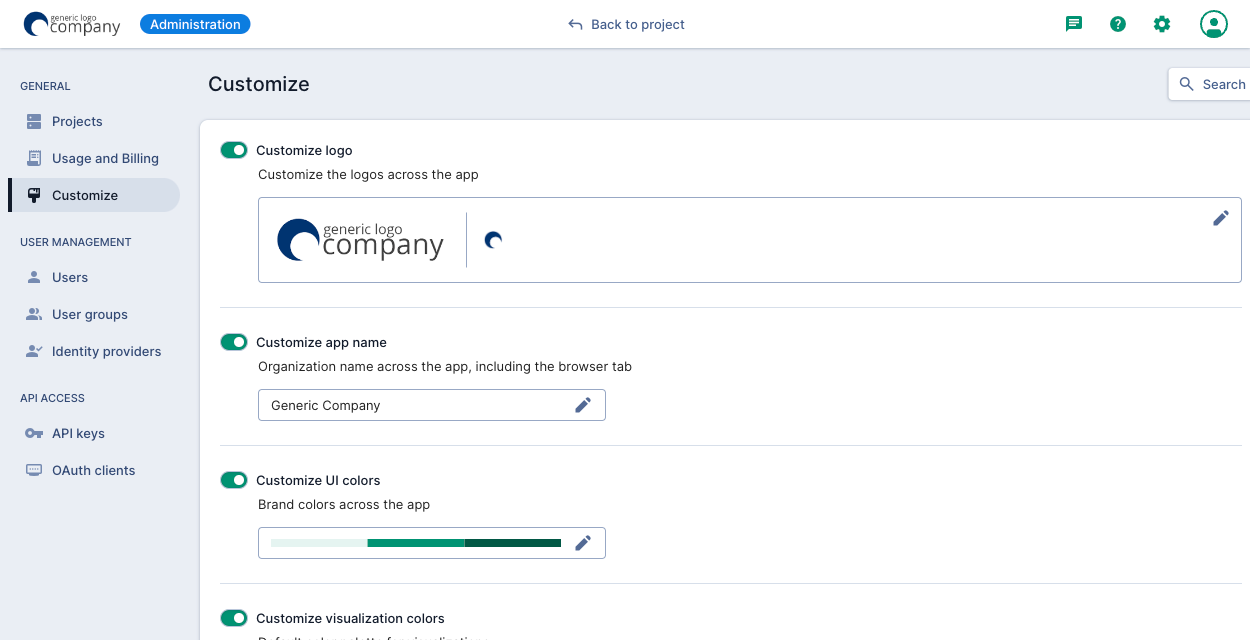
Customize logos
On the main Customize page, select Customize logo.
You can customize the following logo types:
- Full: The main logo that appears on the login dialog and in the top left corner of most pages in the UI.
- Favicon: A small icon that appears in the browser tab title. Note that due to a browser limitation, the favicon doesn't appear on Safari tabs.
Customize application name
On the main Customize page, select Customize app name.
The application name appears across Polaris, including the login dialog and browser tab title.
Customize UI colors
On the main Customize page, select Customize UI colors.
Enter or select a custom brand color to appear across the Polaris UI, including the following:
- Data cube, dashboard, table, alert, and report icons
- Links and link highlighting
- Buttons
Customize visualization colors
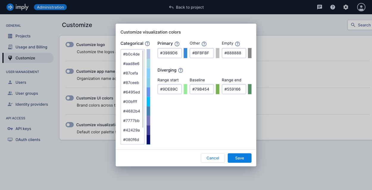
On the main Customize page, select Customize visualization colors.
You can customize the following visualization colors:
- Categorical: A set of colors used to differentiate category-oriented data. Configure a minimum of 2 colors and a maximum of 20 colors.
- Primary: The primary color to apply to a visualization. For a bar chart with a single dimension, bars adopt this color.
- Other: The color for dimensional values that do not fit in a visualization.
- Empty: A single color for background and unpopulated areas.
- Diverging: A set of colors to apply to heatmap visualizations only:
- Range start: A single color to apply to zero values (=0).
- Baseline: A single color to apply to for the negative data range (<0).
- Range end: A single color to apply to the positive data range (<0).
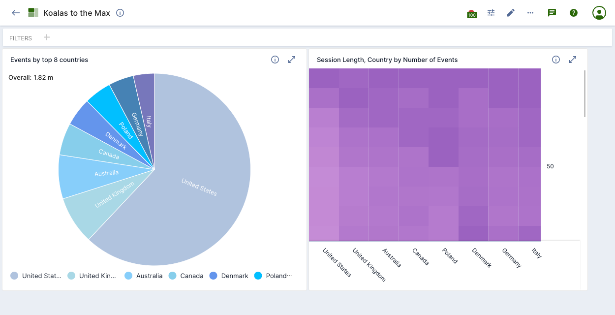
For example, the following visualization colors are reflected in the pie chart and heatmap visualization in the dashboard beneath.
Learn more
See the following topics for more information:
- Managing data cubes for managing data cubes.
- Dashboards overview for managing dashboards.
- Visualizations reference to learn about the available visualizations.